
Highest rated logos
Highest rated logos · Page 284

GRYPH. logo concept


Fotozi is the perfect brand for a photography related website where you can download, upload, buy, sell, or share all your photos.

Logo for a Hotel
Balena italian cosmetics

Sunny Wines is a small wine importer from Warsaw/Poland. The aim was to combine letters SW with wine symbols like grapes or cork screw, but the client wanted to see also more elegant symbol combining those letters.
Ozeal is a group of ambitious adventurers, a large family, based in London, leading different ways of life but sharing the same mission: providing all our customers with high quality, richly designed yet low-priced glasses. The idea to set up a website and sell high quality glasses at a low price to anyone in need was brought up about 3 years ago and then we started to embark on this journey. The truth is: we do enjoy it. We name our website as OZEAL. Because we are enthusiasts, we are passionate and we are carrying on our mission through this website with great zeal. Most importantly, we want to pass this zeal on to any of you.

Monogram

Numerissimo is a company located in Paris specialized in scanning, archiving and editing technologies, with a strong innovative and creative potential. Brand Brothers designed the graphic identity and branding, with a logotype that reminds technicality and graphic works in a simple, pure and creative spirit.

Logo design for “Gewoon! Wijn & Bier” (translated: Just! Wine & Beer), a Dutch café. It got us a lot of free drinks...

Brand identity for a company specialising in Drone Operations.

Ready made logo design.
Militree Design & Clothing Concept Logo
logo for a catering services company based in mexico.

HARPY is fresh modern dynamic brand with short easy memorable name. It will suite well to any business or industry.

Logo

Advertising agency "Fominova" Almaty, Kazakhstan
Muzi(c)loud - this is the perfect & clean brand for a streaming radio service.

"Marketing w czasach mobilnosci" is a series of training courses.

Rocks and Road is a company who offer cycling coaching and guiding. Unlike most cycling schools and coaches, Rock and Road offers the unique service of guided bike rides and one-to-one coaching for a combination of both off-road mountain biking, and road biking. It was important that the logo be designed to attract riders of any level, and not to alienate riders of a lower ability. It was also important that the design appeal equally to both men and women who want to keep fit, who want to get the most out of their cycling equipment, and want to achieve their personal goals. The final logo design presented here includes a mountain bike icon, which is a monogram of the letters R and R (for Rocks and Road).
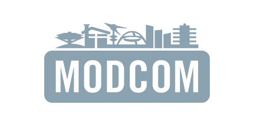
Los Angeles Conservancy's Modern Committee (Modcom) preserves modern architecture in Los Angeles
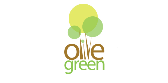
Olive green is an emerging apartment construction company. Dedicated with the idea of not harming the mother nature.Given this situation, logotype identity should be relevant with the name mentioned. Since the logotype was to define the olive green and maintaining green nature. The logotype was made out from the concept design of olive tree and the color combination was maintained as such in nature. With the idea of olive tree, we integrated the name in between the tree on its own wooden color. And the green was made out in the same color to represent the green environment preservation.
Proposition in competition for new logo of Museum in Gliwice.

Children's creative place
Oil company