Highest rated logos
Highest rated logos – Page 28
Logotype and visual identity for a bodybuilding and fitness center. see more: http://bit.ly/1pVOvZL


wedding salon

www.dribbble.com/shots/2578267-Shot www.behance.net/piotrgorczyca
Logo proposal for a digital media that working together with talented creators to write articles, produce videos and publish the content to the public.

Custom made logotype for a digital agency
House Coffe

Health, sport
sesibol.com music finder logo http://www.behance.net/gallery/Sesibol/5600099

house wood
Logo for Bella Florist.
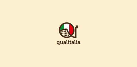
A logo made for a very original (and small) italian language school in Warsaw / Poland. I wanted to keep it simple. The 'qi' letters stand for 'quality' and 'italy'.

The logo is made from six stone shapes. Three make an abstract meditating figure and three create an aura surrounding the figure.
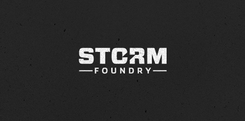
New logo design for UK based video production company Storm Foundry

Logo design for software for screen sharing with multiple mouse pointers

hang concept
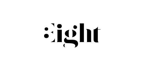
Expressive typography logo with negative number 8 hidden in the first letter.

Burrito Ninjas
one more reuopload.

Naming & typographic logo for wine producer. The combined initials symbol expresses wine glass & wine drop.

Cafe&Restaurant

Unused proposal for a clothing brand.

Art & Entertainment
Khan the Conqueror
Single letter from marathon Logodays. J + note + saxophone = Jazz You also can buy it on shutterstock: https://www.shutterstock.com/ru/image-vector/jazz-music-logo-on-black-background-461586016?rid=3611111 More info about fast logos like this one here: https://fankin-a.myportfolio.com/logodays