Highest rated logos
Highest rated logos – Page 268

Logo for a home decor business. The mark represent's the companies initials CQ and the sun, sea and scenery of the Caribbean.


Logo for publishing company. quote + finger
smilepixel.com for media, digital design area, internet companies etc.
Design for GEC initiative

Human resources consulting organization based in Paris, Quintecia trusted Brand Brothers to redesign its corporate identity and its global branding. Professionalism, credibility, transparency and proximity are the values passed through this new identity, wich includes an original typography.

Sweet Home

Ready made logo design.
In the Banat village of Mokrin, in the far north-east of Serbia, on the estate known as the House on the Flat Hill, for the last three years a peculiar creative center is coming to life - a unique meeting point of arts, education, design, social and technological innovation, traditional craftsmanship and cultural industries... This unique multi-functional complex is designed to provide an inspiring environment for collaborative work of artists, scientists, designers, researchers and professionals from a wide range of disciplines. Through the transformation of the abondoned estate into an multi-functional innovation complex, the House on the Flat Hill is converted into House of Ideas. The project was executed for the purpose of Branding the new HOUSE OF IDEAS in the Banat village, Brochure, Ipad application, logotype & branding was following the new aesthetics. The architectural studio AUTORI for the past three years they have been working on the execution of the new and reconstructed buildings on the House on the Flat Hill estate, in collaboration with Terra Panonica. The House on the Flat Hill as the House of Ideas continues to be a meeting place of creative people from a variety of disciplines - from business to culture and arts - who are invited to realize their ideas in various forms, or to take part in the programs that House of Ideas will be organizing. - See more at: http://www.vsumic.com

Logo design for 'Coffee & Fandisha' an independent coffee shop based in Baltic Triangle, Liverpool.

Dota2 Ursa

CRASH

This logo is inspired by Chinese culture. Perfect for restaurants serving chinese dinners.

Virginia distillers assotiation

Mushroom restaurant
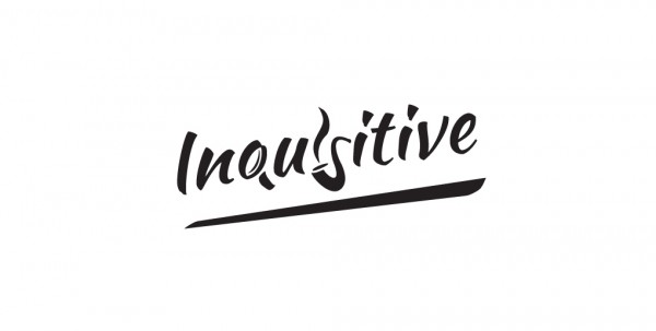
An image makes a thousand words. The magnifying glass, the pipe and its smoke send you thinking at Sherlock Holmes, the most inquisitive literature hero. They also fit pretty well as the letters in the text.
InModeration is a site where you can analyze your 'Physical' & 'Digital' social life in accordance to the survey you fill out. http://in-moderation.com

Wales YFC Brand by designdough

Work for interactive agency. Formiko means an ant in Esperanto. So it was a simple task - all Mootto had to do was to find an ant and draw it as close to the original model as possible. This is what an average ant in Mootto world looks like.
A logo for a travel agency.
It's a jungle leaf :0 My best logo so far!

https://www.behance.net/gallery/40556041/Interespacio- INTERESPACIO: based on the characters of (I)nterior and (E)spacio + celosia. The study came from Mexico. Three years ago, as first instance began with interior design and architecture, then we got and started working professionally. Throughout the time we moved to Argentina and the idea of opening our own trade and professional studio. We needed a nice, comfortable place for people to know us a little more and we could show our knowledge in: products and services

Travels Company
Fungnuehc is a small team of passionate creators changing the way you think about handmade leather. We do everything ourselves from start to finish here in London. Playing typography for the name of 2 owners. "fung" and "cheung" to be the logo. http://www.fungnuehc.com/

Grill × Bar × Boutique