
Highest rated logos
Highest rated logos · Page 225
..known reverentially as "the great grandfather", may be as much as 300 years old, although experts estimate it is more likely 80-100 years old


hairdresser monogram

SPORT WEAR

logo for barbershop

http://wp.me/p4571j-v2
Logo designed for company which sells supplements
Combing the letter of "C" and the letter of "U" to be the logo.

Just for fun
The Construsilva is a company whose main focus on the Angolan market in the area of construction.
Prizes for being a reference in construction, restoration and refurbishment of residential and nonresidential, we rely on our staff with highly qualified and skilled labor, because they know that the only way you can achieve the ultimate goal, the satisfaction his client.
A brand new photography business specializing in dog photography.
Educational Trust

Big fan of ninja cartoons so i made a logo This was done just for fun But if you're interested in this logo it is for sale Thanks for clicking

Inspirational website and facebook page revolving around Osho`s thoughts on happiness. In a nutshell: being happy "for no reason at all" (in Polish: "bez powodu").

Saint George fighting with the dragon.

Logo for a holiday park specilising in Native American experience holidays.
Healthy slow food brand
A web design & communications company.

Deporte y Artes Marciales
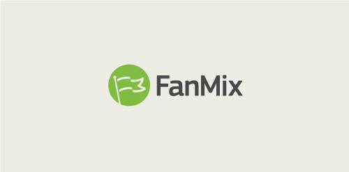
Subtle F and M letterforms in the symbol make the flag. FanMix finds and compiles all your fans on the internet, what they are saying about you and who likes you, and compiles the information into databases.


This is one of four log concepts that i designed and developed for a client. Their business is brand protection so the concepts had to be crystal. This logo didn't get picked as its visual associations did not relate to the corporate values of the client. I may recycle it as a personal brand id but still the visual elements has no relation to the name of my business "atoms". Thanks

WildFig Mediterranean


NASTY ICE CREAM is fresh modern dynamic brand with short easy memorable name. It will suite well to any business or industry.