Highest rated logos
Highest rated logos – Page 214
Benelli shop


logo for pet service company

Fire Resistance Solutions: the combination of flame, shield and drop of water in one sign. --- Designer: Piotr Ploch
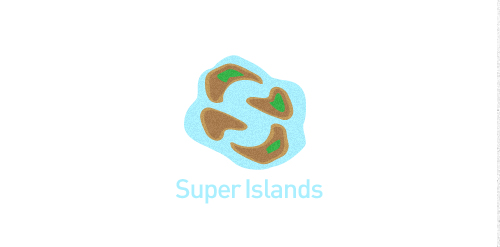
This is concept of fictional brand.

https://www.behance.net/gallery/8174829/RN-equipamientos Equipamos camionetas para usos diversos. Equipamientos para ambulancias, transporte de pasajeros, cargas especiales, familiares, móviles de trabajo, cargas de baja temperatura, Motor Home y transporte escolar. También cubrimos el segmento de 4X4, donde ofrecemos barras antivuelco, estribos, cobertores plásticos, lonas cubre cajas, defensas, ganchos para traylers y ambulancias. Estrategia creativa Creative strategy
Fun logo. Stop. Eat. Go. You can buy it if you like.
Logo for a new residential sector developed at the heart of beautiful nature.

Geek Eyewear ®, who sell chic eyewear celebrates diversity, individuality, and creative enthusiasm of Geek culture.
A flippable, reversible logo that always reads the word ‘GEEK’ no matter which way you look at it. The shape also looks like a geek wearing glasses. The angular shapes relate with the technology industry, whilst also looking like an alien language.
Unfortunately this logo design was not used by the company.
logo design for a mobile growth hacking company

media entertainment


A representation of a specific building was required for this project - the Lissadell mansion.

Gminna Biblioteka Publiczna im. M. Ćwiżewiczowej is a library established in 1929. It is located in Podhale, south Poland, region well known for its vivid folklore and deep respect for culture. The most common ornament embroidered on traditional clothing is the flower of carlina, which was the main inspiration for this design.
The idea for the logo came from an old saying:
"A book is like a garden carried in the pocket".
made for fun but evolved from a serious project... :)

Brand test designed for Torre Criativa (Creative Tower, in English), a small Design Agency in Brasil. The logo is a pencil with a medieval window (like a princess tower) and a flag (point of the pencil) on the wood roof. The colors are sugestive, but the blue color inside the rounded square representing the sky, causing to appear high tower as well as the level of creativity.

Logo proposal for an embroidery studio

Logo for competition - Gdynia Design Center in Poland.


The folk collective, who song and dance ensembles coming from warmia - in the Warmia and Mazury region of nothern Poland.

Octoplus logo

Final logo for sailing company. Typeface: Ubuntu 500 Italic. A letter as a sail.

Hi all, This is a logo design for a bird sanctuary in South Africa. I have chosen to use warm and earthy colours. The chosen font gives a sense of nature and the African jungle. Alongside is a bird icon

Visual design