
Highest rated logos
Highest rated logos · Page 213

ZipLadder concept logo


SUNDAY MARKET - it's very atmospheric project. Every Sunday in Omsk, the club Atma-Sphere held SUNDAY MARKET, where a warm and friendly atmosphere you'll find a unique jewelry and clothing, choose a toy or a beautiful handmade notebook, can meet a truly original gift for a friend or for Mom. Live music, free workshops and presentations, as well as free tea and delicious homemade sweets.

unused poposal,
www.mikemark.com Logo for a students' conference
To create the Saniport’s logo, the element of inspiration was the water. The logo is thus made up of two droplets whose colors represent the duality / balance of hot and cold. When water vapor meets a cold surface (as in a toilet when bathing, for example), some small water droplets appear, represented by the logo particles.

Company logo. Zeebrands slogan is "the long-lasting brands" and to express this in logo mark we used the old style of drawing in caves and chosen to draw a turtle as one of the long-living creature on the earth.

talkTV is a live streaming video platform.

hairdressing salon
Fun logo. Stop. Eat. Go. You can buy it if you like.

Geek Eyewear ®, who sell chic eyewear celebrates diversity, individuality, and creative enthusiasm of Geek culture.
A flippable, reversible logo that always reads the word ‘GEEK’ no matter which way you look at it. The shape also looks like a geek wearing glasses. The angular shapes relate with the technology industry, whilst also looking like an alien language.
Unfortunately this logo design was not used by the company.

media entertainment


A representation of a specific building was required for this project - the Lissadell mansion.
made for fun but evolved from a serious project... :)

Brand test designed for Torre Criativa (Creative Tower, in English), a small Design Agency in Brasil. The logo is a pencil with a medieval window (like a princess tower) and a flag (point of the pencil) on the wood roof. The colors are sugestive, but the blue color inside the rounded square representing the sky, causing to appear high tower as well as the level of creativity.

Logo proposal for an embroidery studio

Logo for competition - Gdynia Design Center in Poland.


The folk collective, who song and dance ensembles coming from warmia - in the Warmia and Mazury region of nothern Poland.

Octoplus logo
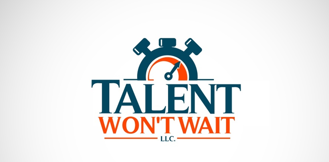
logo for a talent coach, wanted a bold design that created a sense or urgency

Logo that shows that I love parrots in uniforms :)

Visual design
Benelli shop