
Highest rated logos
Highest rated logos · Page 199

An Elegant Flamingo


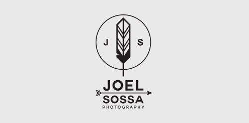
Personal identity for Joel Sossa, professional photographer from Guadalajara, México.Passionate by arrows, feathers and all about yaqui, cherokee, north american indians and their culture, the reason why the logo is. One of the most important and subtle elements on this logo is the circle, which represents the dream catcher like the circle of the camera lens, Joel Sossa is always capturing natural moments, people and landscapes with a particular style.

Service of recommendations

Rocket Digital
Mantis


Advertising agency "Sapiens" Almaty, Kazakhstan

a concept logo designed.


separately from logotype Alice is sign for this girl

Active rest


Logo for fashion brand


Inspired by amazing Mikey Mike. For sale.

Concept logo design for a client in the construction and building industry here in St. Louis.


Logo for an online blog host. The mark is a combination of a sheet of paper and a letter S.
unused logo for finance company