Highest rated logos
Highest rated logos – Page 111

Mr. Robot tribute


"Vsya Posuda" means "All utensil" - on-line shop.
.

Conceptual Design

Bear Logo I made for software development and consultancy company.
Logo idea rejected by client. It is an unused proposal for a media-related company and now it's for sale.

Dutch internet agency

Logo for the Toronto Star and the Performing Arts for events.

Custom lettering/badge logo project for a photographer from Vienna, Austria. :)

wordmark/ambigram of the word 'antique"

Spoilerman movie blogger.

Ambigram made for CD Cover of a rock band from Florida called Unfold.
Simple royal logo with KingFox for almost any business.

little fox

moon beauty of women

Finalized concept for a website which lets you manage your health records online along with many other things such as health trackers, health scoring tools, smart cards access to top doctors, and intelligent alerts & reminders. Approved by the client.
CENOXO - logo design. Based on customized typeface, strong C logo mark, technology, brain, development and connection.
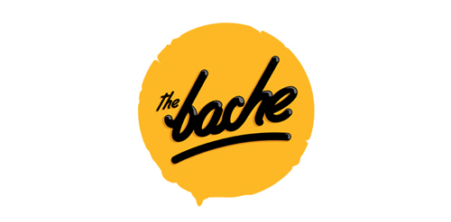
The Bache is the name of own small business in video productions and graphic design. It is pronounced as ‘The Badzje'. Little shameless self-promotion right here: www.thebache.nl
Robotic crow logo created for micro-assembly handling station. Unused proposal.

this is a company logo design and interior architecture
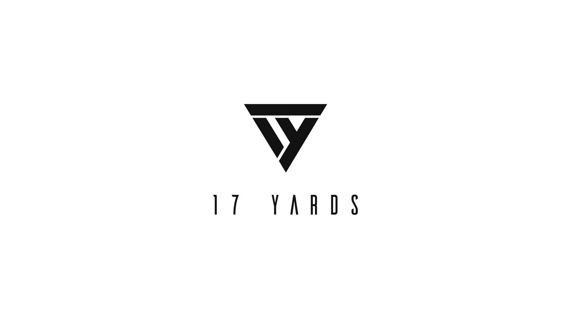
With combo of 17 makes beautiful logo of 17yards. It has a proven track record of partnering with homeowners and design professionals in the Delhi NCR.
Little Kid

Victoria is a financial fund based in Warsaw. The key was to combine a eagle (symbol of Poland) and V letter (for Victoria). There were several concepts - some modern, some classic, more decorative with a pinch of victorian styling.