Scary Bowls
Scary Bowls
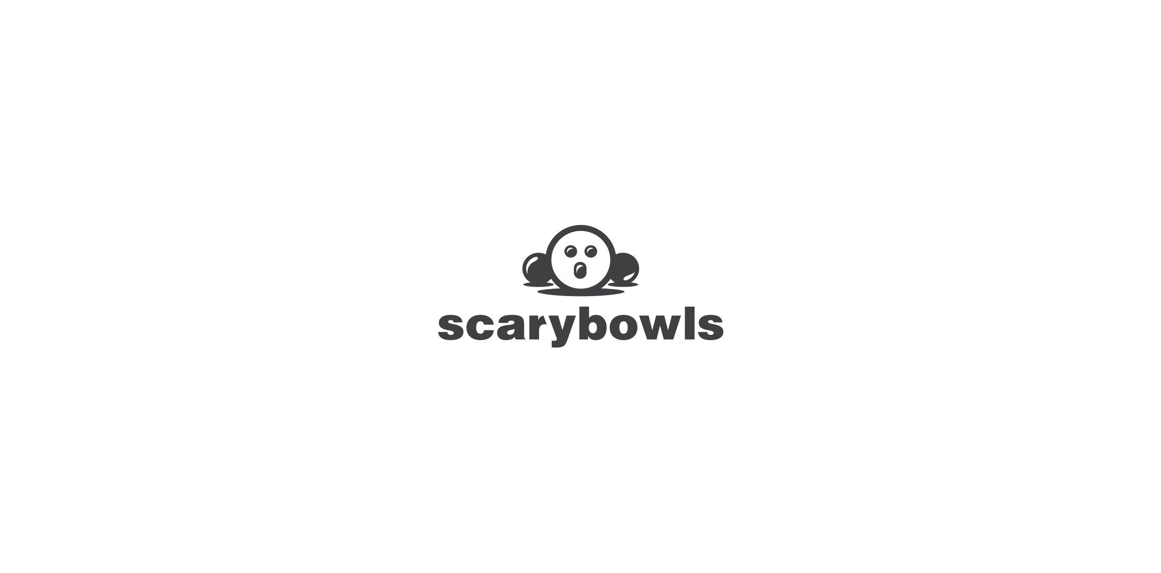


- Bowling club logo.
 Designer: Future Form
 - Submitted: 05/28/2016 • Featured: 08/21/2016
- Stats: This logo design has 8687 views and is 2 times added to someone's favorites. It has 6 votes with an average of 2.50 out of 5.
Designer