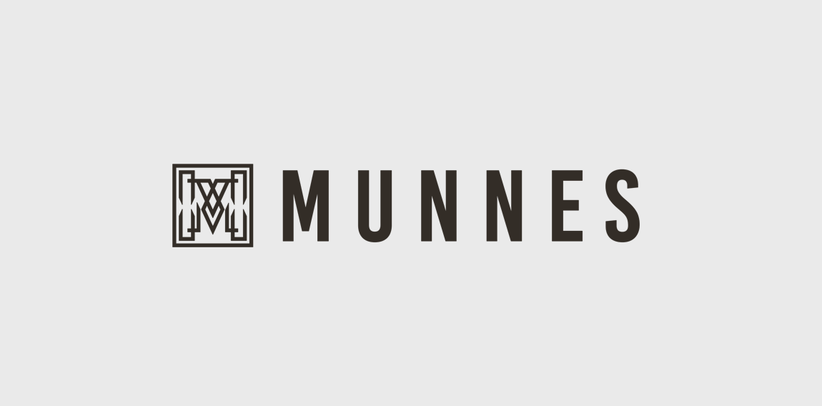
Designer: My Vice Graphic DesignMunnes logo In order to highlight the quality, style and distinctive character of the Munne glasses, we have developed a logo that reflects all of this. He chose a stylish combination of an icon and a name. Using graphic details, we have created a unique and exclusive design of the character - the letter "M". The square contains a hollow letter, which consists of various graphic details and shapes. This style looks like a non-banal, unobtrusive, and eye-catching one. To keep pace with classics and aesthetics, we selected a combination of two colors, a white-and-white. It helps maintain the image of a neat, modern logo. We branded the brand next to the symbol. We chose the color of this dark brown, color. The brighter and "heavier" name of the brand has become like a counterweight, a dimmer symbol, while preserving the integrity of the style.
This is a logo mark for amazing company named in french "Trouve un pro" - this means "look for professional". So there you go! - person looking for professional, like a detective who always finds what he is looking for