Featured logos
Featured logos – Page 326

A human zippper, connecting little people, bringing them closer together.


Service of recommendations

software company... wasted time and energy. Unused proposal.

For a company near Riding Mountain region. Thought it would be nice to incorporate that into the logo because they wanted to use a P in the logo design.

I made this logo for 2011 year, the year of rabbit by chinese calendar just for fun.

Logo for a dance school... A music note embedded part of the body shape...

Is it a Ink Splash... Is it a Fish? NO! Its Both - INQFISH :)
Condominums

Logo for a Tour Operator to france... Alléchant is Enticing in French... The letter A is shaped to create Eiffel Tower :)

German electronic music records label.

Online portal with magic tricks.

Logo for an Anti-Spyware
I hope no need of description

Logo was created for site deappetizer.com. Deappetizer.com is for people, who used to eat a lot, but decided to do something to reduce their appetite. Idea is simple and clever in my opinion: the site presents unpleasant pictures, which should spoil your appetite. And before a meal you can visit this site to change your perception of food for a while. All of the pictures are divided into three levels by their effect. The further the stronger. Concept: imagine that «Deappetizier» is very unusual restaurant, where guests come to refrain from eating, so the primary duty of a waiter is not to allow a guest to eat. All the waiter’s efforts to discourage guest’s appetite formed the basis for a series of logos for each level of pictures: Level 1 https://www.logomoose.com/members/alisa1711/showcase/logo/244/ Level 2 https://www.logomoose.com/members/alisa1711/showcase/logo/245/ Level 3 https://www.logomoose.com/members/alisa1711/showcase/logo/246/ Also you can see logo in bigger size and on the white background at http://revision.ru/work/36475/

This logo is designed for a company who's product is a half inch cube made of a petroleum product that will burn even after being submerged in water. This will help you get your camp fire started. The client wanted to give the logo a feel of a product that has been around for awhile, so the design took on a retro look and feel of the old cigarette lighters.

Logo for pet-shop "Mustachioed and Stripes" additional https://www.logomoose.com/members/alisa1711/showcase/logo/69/

concept / personal work.

Sun rays treated like city buildings
restaurant with Italian cuisinie

concept work

dj booking agency

We are building an online travel experience and brand focused on socially responsible travel. We are teaming up with international experts, government agencies, nonprofits, small businesses and communities to revolutionize how people plan and experience their trips. We are young, hip and forward-thinking with our finger to the pulse of pop culture. "Vaya" is the command "go!" in Spanish. "Vayable" is pronounced like "viable," which means capable of living, growing and developing adequately. To connect people through travel for the sake of creating happier, more authentic and sustainable experiences for travelers and the communities they visit. honesty, ingenuity, authenticity, adventure, compassion, ambition, edgy, cooperation, optimism, efficiency, wisdom Using the negative space to combine two concept which are the Google pin and the concept of logo(Vayable). Take the trip, change the world.
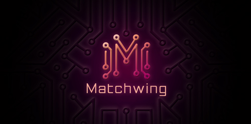
Logo description: A Web design (graphic, 2d animation) company logo. Design based on simplified graphic of matches to form "M" which it also look like circuit which represent web solution. The side of the "M" is in spread out form, which similar shape like wing.

Logo for a toy store.