Featured logos
Featured logos – Page 318

Logo I designed for fun.


Logotype for shoes company

Logo for a social media website called Beat Fettish. It's going to be a place where little known producers and songwriters can go to post and sell their products. "F" is in the negative space.

Logo for some internet SMS service

логотип для магазина постельных принадлежностей

logo design for an organic fast food company.

Logotype for website about Sochi town
Fall 7 times and get up 8 times, is a japanese saying, that has inspired this logo. The logo is for a photographer based in Canada.
cyclic music event

emailaa, beautiful newsletter designs
90 anniversary design for local business

GMC Software Technology develops innovative software solutions for personalized customer communications. Their market is fundamentally changing from print communication to multi-channel output on eletronic devices. In order to meet the new market trends, the swiss-based company is introducing a new solution named «Inspire» . The logo with the swinging, colorful stripes was designed to express how the software solution creates powerful customer contacts, delivering personlised messages on multiple channels.
Ioannis Panagopoulos is a Software Engineeer.
“The missing piece” of a puzzle was the concept for the symbol of this identity. As a result, a “human-lookalike” symbol was created based on a piece of puzzle, to show that without it, a project cannot be completed.
Logo for a travel software solutions company, based in Athens.
Aristea Kostopoulou is a professional masseuse based in Athens. She provides services at one's home such as reflexology, therapeutic massage, relaxing massage, reiki and more..
The inspiration of this logo was the great love that Aristea has for her work and the "magic" that she provides with her hands!
The inspiration of the identity of this construction company was the actual foundations of a building under construction.
A 3-dimentional symbol was created based on letter “T” (The initial letter of the company’s name) as the base of the construction, expressing the company’s values, such as trust, accuracy and professionalism.

The logo endeavours to encapsulate the feeling of holiday parks in North Devon, the joviality of camping and caravanning for all the family. Woolacombe

Logo for social music site
new "skipping-rope" logo for http://skakanka.com.pl/

Purple rats - logo made of abstract, purple color, shapes. This logo can be used for any industry. The logo represents courage, precise, modern, aggressive, etc
Logo for an organisation keeping track of the black swan.

logo for company which sell an architectural projects of detached house. in english "projekty na miare" mean "projects made to measure". more or less:)
For this wedding, a unique symbol-logo was created, based on the initials of the two names of the couple ("a" for apostolos & "s" for sophia, in greek alphabet, lower case). The symbol looks like the "apeiron", the symbol of infinity. It also looks like two leaves that connote freshness and youth. This logo was used as a stamp to seal the invitation with sealing-wax.
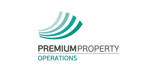
Logo for an established property operating company in Athens, Greece.