Featured logos
Featured logos – Page 317

Landscape design


A logo for a floral business that specializes in roses and the delivery of roses on short notice.

Logo for 'narrow casting' software build by Silva-IT (as seen on: http://www.logomoose.com/logo-design/silva-it/)

The new logo for Mystery Islands, by Finland based Electronic dance music producer, artist and mastering engineer Jani Kervinen. Go check out some of his legendary tunes here: http://soundcloud.com/mystery-islands

Monogram/Ambigram with custom type for a luxurious fashion brand.

Logo on the package
Personal Portfolio Logo Concept.
Roostar logo. R/S, Rooster/Star

Satin stitch embroidery

golf

Architectural design bureau. Designing in building. Technical advice. The name "constravia" relates to the scandinavian roots of the bureau founder (construction+scandinavia). The mark relates to the letter "C".

Possible for a system of monitoring their children's

cafe, caramel apples

Genius is in the genes! A play on the words genius and genes with the lighbulb representing inspiration and the dna element representing genes.
ShaunMarq is a person, a brand, a team taking fashion, media and design to the next level.

Logo for a sail club.

Cockhorse new symbol for children apparel.
Logo for a art photo house.

"Synthesis Centre" is a centre of physical and spritual health, in Athens. The services provided are consulting, psychotherapy, stress management, astanga yoga and more..
The concept of this corporate identity in general, is a "ball" that represents one’s soul and/or body that "unrolls" after being taken care through therapy and yoga. As a result, the symbol of this logo represents the physical & spiritual "lift-up" of a human figure, "the ending point" and the "result" of this whole experience.
In order to express its unique character, The logo was created from one single, black-inked line to show a handwritten style.

Logo design for a local baby shop. In Mandarin, "Hai" means "ocean" or "sea". The shop owner specifically requested a sea creature to be applied on the logo.

Another version of Hai Baby Shop logo ("Hai" = "ocean" in Mandarin), but the client was already too happy with the original one and closed the deal so I decided to keep this as our own experimental project. :)

baby food
Sophia Georgopoulou is a graphic designer from Athens, Greece. A logo was created based on the initials of the designer's name ('S' for Sophia and "G" for Georgopoulou, in lowercase). This logo is applied in a fresh-mint Pantone 353 C that connotes freshness and youth. The logo is compact, austere but also friendly and eye-catching.
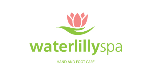
WaterlillySpa is a beauty salon in Athens, Greece, which is specialized in hand and foot care.
The source of inspiration is the actual waterlilly flower. The green leaf looks like a woman's hand holding the flower.
The logo combines softness and care and it uses fresh colors.