Featured logos
Featured logos – Page 265
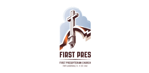
Redesign of the church's old logo in a stylized, illustrative manner, making it more welcoming, contemporary, friendly, casual, & upbeat. Client specified a rendering of the church’s architectural arch and cross in the perspective in this photo, and required an emphasis on the church's nickname, “First Pres."
Here, crisp, exacting vectors emphasize the architectural soundness of the church — a metaphor for the concept of faith as the solid foundation in one's life. This design makes use of hatching to add gradient dimensionality, enabling it to easily reduce down to 1-color. Colors are indicative of the building itself, including terracotta roof. Check my Flickr case study or Dribbble for more images, detail, and full design rationale.


MoonCake Cafe logo design


Logo for catering agency (food served by models)

Logo for the electronic library.
Obvious joke object project

Logotipo para próxima página de novedades tecnológicas
Logo for WannaWoo iPhone app

Producer of anti-theft systems into flats

Freight Forwarding Company

Logo for Lviv sport team (ultimate frisbee).

Prince's Foundation for perfumes and cosmetics

A logo for a real estate agency. Abstract and modern design was required.
New logo for newly started graphic design company.

Had some fun with flower arrangements recently. Juliana aka logopond lady is another beauty in my collection.

A representation of a specific building was required for this project - the Lissadell mansion.

earphones logo

Creative logo that illustrates the product branding.

A logo for a motivational speaker and marketing consultant. The keywords was strong and powerful. Custom typeface and a mark representing a flying lion.
logo for goodies
made for fun but evolved from a serious project... :)

Producer blocks for children

GUS-Trans has a narrow specialization, they provide their transport services to one direction, namely from Europe to Russia or other CIS countries. Their goal was to have a logo that without an explanation tells what they do, how they do it and distinguishes us from others.

EFEXO is fresh modern dynamic brand with short easy memorable name. It will suite well to any business or industry.

Manufacturer of dairy products.