Featured logos
Featured logos – Page 229

Logo for office business. Ram made from clips.


Logo design for an electrical and hardware shop called Focal Point
A clothing company based in Nairobi Kenya.

Dow Indicator

Approved logo for expose. The type is created from zero. I went for a rounded approach to communicate a friendly and inviting feel. The mark symbolizes abstract light beams forming the expose action coming from the edge of the "e" The red/green/blue color stands for light and yellow/orange/red represent the levels of sound volume.

'Foqus Jongeren Filmfestival' was the name of my graduation project, a fictional film festival which focusses on old-school 3D movies. Anaglyph baby!
Touché Collective is a young creative collective from The Netherlands. Check them out at www.touchecollective.com
Novo-Yurlovo (New Yurlovo) - a large apartment complex with a well-developed infrastructure located near Moscow, on the edge of the forest.

ROSA RUGOSA Wine

Logo done for an internet security development program.
The Bache is the name of own small business in video productions and graphic design. It is pronounced as ‘The Badzje'. Little shameless self-promotion right here: www.thebache.nl

Mosaic sunflower. The negative space between the petals also shows an abstract sun with six sunrays.
KM
Logo for the developer of games and applications.

logo for web portal with sales and promotions

Identity for a women shoewear company based in Larnaca, Cyprus. The idea was to create a clean, slim and luxury look adapted to women's culture and taste.
Logo created for a new startup company.
Online book publisher.
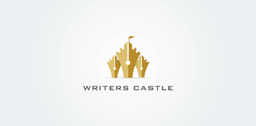
Concept logo with a castle and fountain pens.

BIRDTALK is fresh modern dynamic brand with short easy memorable name. It will suite well to any business or industry.

group of companies
Professional logo for a water and plumbing company. The icon has a tap with a water drip. The pipe also forms a P. This adds a clever touch to the logo design. The blue, black and white colors make the logo look very vibrant. The font has a pipe like feel which adds to the concept of the logo design.

Logo for a child adoption consultant. www.theadoptionnavigator.com

Logo for online gamers.