Featured logos
Featured logos – Page 192
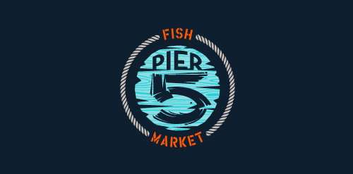
This logo is for a completely fictitious fish market.
The idea came to me when I discovered that it was possible to achieve a fish shape in the negative space within the bowl of the number 5. Dubbing my hypothetical company Pier 5 Fish Market, I created this illustrative mark in the hopes of really capturing the spirit of the nautical and maritime aesthetic. Type is custom for "Pier" and also the number 5, which is hand-rendered to look like it was painted on a wooden sign with a very wide, worn-out, thick-bristled brush. While it was important for the fish to show in negative space, it needed to look like a seemingly happenstance result of logical, real-world brush strokes. This is the minimal, alternate version of this logo.
Click here to see the case study for this logo, which chronicles its development, and includes full design rationale, sketches, electronic roughs, and alternate designs.


Logo was created for an insurance company. The logo incorporates a classic, ornamental icon and clean font.

Logo for trees

Logo for real estate

Logo for travel

Logo for tree

sold Logo for real estate

Logo (icon) for a forum about drinks

Dukat - luxury gold jewellery

Logo created for a line of aluminum frames.
Logo for a street wear company due to launch this year

Brand name : Pivotal / Field: Real estate, Investment / Year : 2013 / Location : UK for more check it out http://www.behance.net/gallery/Logotypes-Marks-2010-2013/9215817

Logo for Vinted. "Vinted" is an Internet community where users can swap, sell or donate clothes which they do not wear anymore. We, as a tie a tie design agency, are proud to present our input to this emerging community with logo design, online and offline branding, brandbook. Please check it on Behance: http://bit.ly/11Jujwq And on our personal portfolio: http://tieatiedesigns.com/

Logo for producer of high quality, handmade glassware from Poland
Logo for speech center.

Logo for IT company

Installation and maintenance of vending machines.

place in the network to the presentation of projects of eco-architecture http://www.facebook.com/yaceky

Logo concept for Canadian condo project.
To create the Saniport’s logo, the element of inspiration was the water. The logo is thus made up of two droplets whose colors represent the duality / balance of hot and cold. When water vapor meets a cold surface (as in a toilet when bathing, for example), some small water droplets appear, represented by the logo particles.
A logo design for my personal website
Proposal for Logo of an architecture agency.

Logo for consulting company
Logo for Twin Sister Publisher (unrealized)