Featured logos
Featured logos – Page 170

Logo for sailing site. www.livera.it


Logo for http://pixotico.com Main focus was on minimalism and simplicity.

Logo made for Norway based hi-end clothing line. SÖLVREVEN > Silver Fox in Norwegian.

Ambigram made for CD Cover of a rock band from Florida called Unfold.

Redesign

Regional social network. The most important part of this undertaking is encouraging citizen journalism, hence quotation marks (and tagline "let`s create opinions together").

Ambigram

Logo for the "tour guide finder" app.

Sofit is a soya based health milk drink. The font characters’ were depicted as thin lean and healthy. The curve on the ‘f’ & ‘t’ makes the identity modern & ownable

Logo design Project

Ready made logo.

Logo concept

Logo for coffee house.

Nowe Kompetencje (eng. New Competences) is a training group, which provides its services in the business sector.
Another version for the same action sports brand.

Logo for a dentistry.

The landscape gardeners build as much as they plant, summed up in a marque made of both a garden trowel and leaf.

The symbol depicts continues movement, projecting progressive dynamism. The colour red brings out the passion and energy of the group while blue symbolizes stability and strength The three cogs on the logo signify the values of Integrity, Imagination and Individual

twins

Unused proposal for a foundation based in Panama.

Logo design for clothing brand. Target audience men 15-30 who are probably athletes, in fraternities, and like to drink and party a lot.

Personal project for a brewery I might create...if I ever learn to brew my own beer. http://benjaminkauffman.com/projects/lagerhead-brewing.html
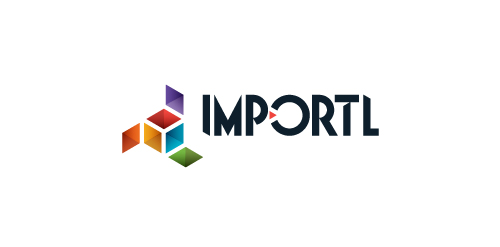
This is a logo for a completely fictitious entity named IMPORTL, which could be an open source web development site, or some type of developer software.
The idea is that the triangular facets form a series of open holes, or "portals," in multidimensional space. The central facets can also be seen to form a cube which is open on three sides. Lying before each opening is another opening on that side's respective "floor," yet, in an Escher-like paradox, where spatial orientation is an irrelevant construct, there is no floor. There is no up, down, left, right, back, or forth. This hyperspatial environment suggests infinite possibilities for the arrangement, manipulation, and exchange of data.
For color, the idea is that the primary colors that form the central cube beget the secondary colors that rotate outward, suggesting expansion, transformation, evolution.
The mark employs a custom typeface that compliments the angularity of the mark.
Click here to see the case study for this logo, which chronicles its development, and includes full design rationale, sketches, electronic roughs, and alternate designs.
Logo design for a company that sells products from wood for health and beauty