Featured logos
Featured logos – Page 129

Scissors,razors,motors.. :)


Exclusive Customizable Logo at Eisaks Logo Design

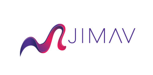
The identity of the builder JIMAV is based on the inspiration that we had with organic architecture. With curved forms we achieved a symbol with plenty life, which is balanced with a simple, legible and solid typography. The logo is a form developed with the approach of the letter “J” of Jiménez and the letter “A”of Avelar, which compound the name of the builder JIMAV. We developed a variety of the logo’s versions and compositions for the use in different applications and to make easier it’s reproduction.

Exclusive Customizable Logo at Eisaks Logo Design.

Logo made in 2104 for the US Embassy event in Bogotá, Colombia for the promotion of pure american cocktails.
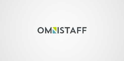
This was a commission we received from a company called Omnistaff - A recruitment Agency based in Johannesburg, South Africa. The company required a minimal logo that signified the multilateral approach they had to staffing solutions. This logo makes use of clever negative space to create the N, which just so happens to look like two arrows pointing in different directions.
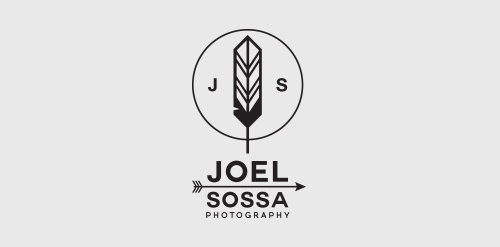
Personal identity for Joel Sossa, professional photographer from Guadalajara, México.Passionate by arrows, feathers and all about yaqui, cherokee, north american indians and their culture, the reason why the logo is. One of the most important and subtle elements on this logo is the circle, which represents the dream catcher like the circle of the camera lens, Joel Sossa is always capturing natural moments, people and landscapes with a particular style.

Exclusive Customizable Logo at Eisaks Logo Design.
Southeastern Homeschool Sports Athletics Logo

3D Architecture Visualization company
Stationary Manufacturer

OMEX

paper machine manufacturer

hospital and medical center
beauty centre & spa
Tea & Coffee suppliers in corporate sector
Paper Manufacturer

FMCG Company
Xcel event and entertainment
logo for art company
IT Industry
Professional printer

on-line jewellery store
Educational Trust