Food Fight Radio
Food Fight Radio
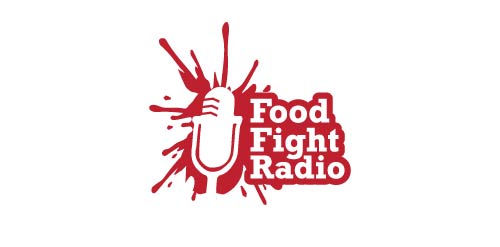


- Same for this one the logo tells it all:) This logo is Load, Fun,Simple and got lot of Life its a food splash and the negative is the Radio Seeker and the text.
www.prowaystudios.com
 Designer: Niko Dola
 - Submitted: 11/28/2013 • Featured: 12/20/2013
- Stats: This logo design has 7766 views and is 0 times added to someone's favorites. It has 5 votes with an average of 2.60 out of 5.
Designer