Polish Space Agency
Polish Space Agency


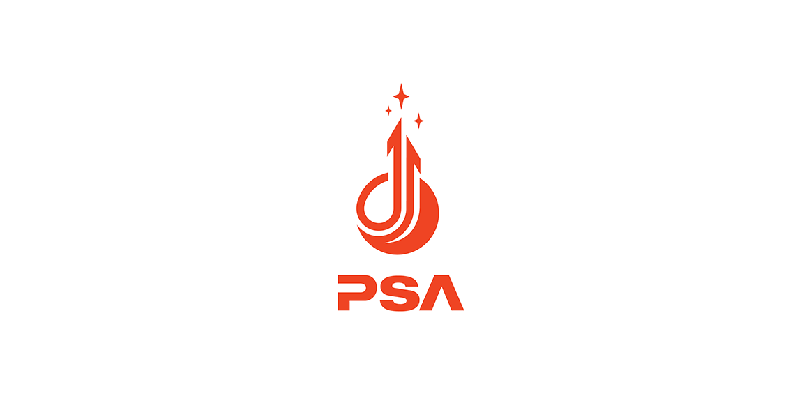
- Logo for a contest for Polish Space Agency. Logo shows a planet and arrows as a 'reaching for the stars' symbol. It's dynamic but stable as well. I'd like to show that logo as a tribute to momdernism polish logos from '60, '70 which was very expresive in its form but simple and clean as well.
 Designer: Logoflow
 - Submitted: 10/17/2015 • Featured: 11/08/2015
- Stats: This logo design has 10951 views and is 4 times added to someone's favorites. It has 17 votes with an average of 4.06 out of 5.