
Logoflow logos (52)

Logo for a clothing line for people training sea sports, surfing, wakeboarding etc.


Logo for the Polish School in Hague (Stichting Poolse School Den Haag). Stork is the symbol of the city. He is wearing mortarboard. National accents are flags on sides of the sign.

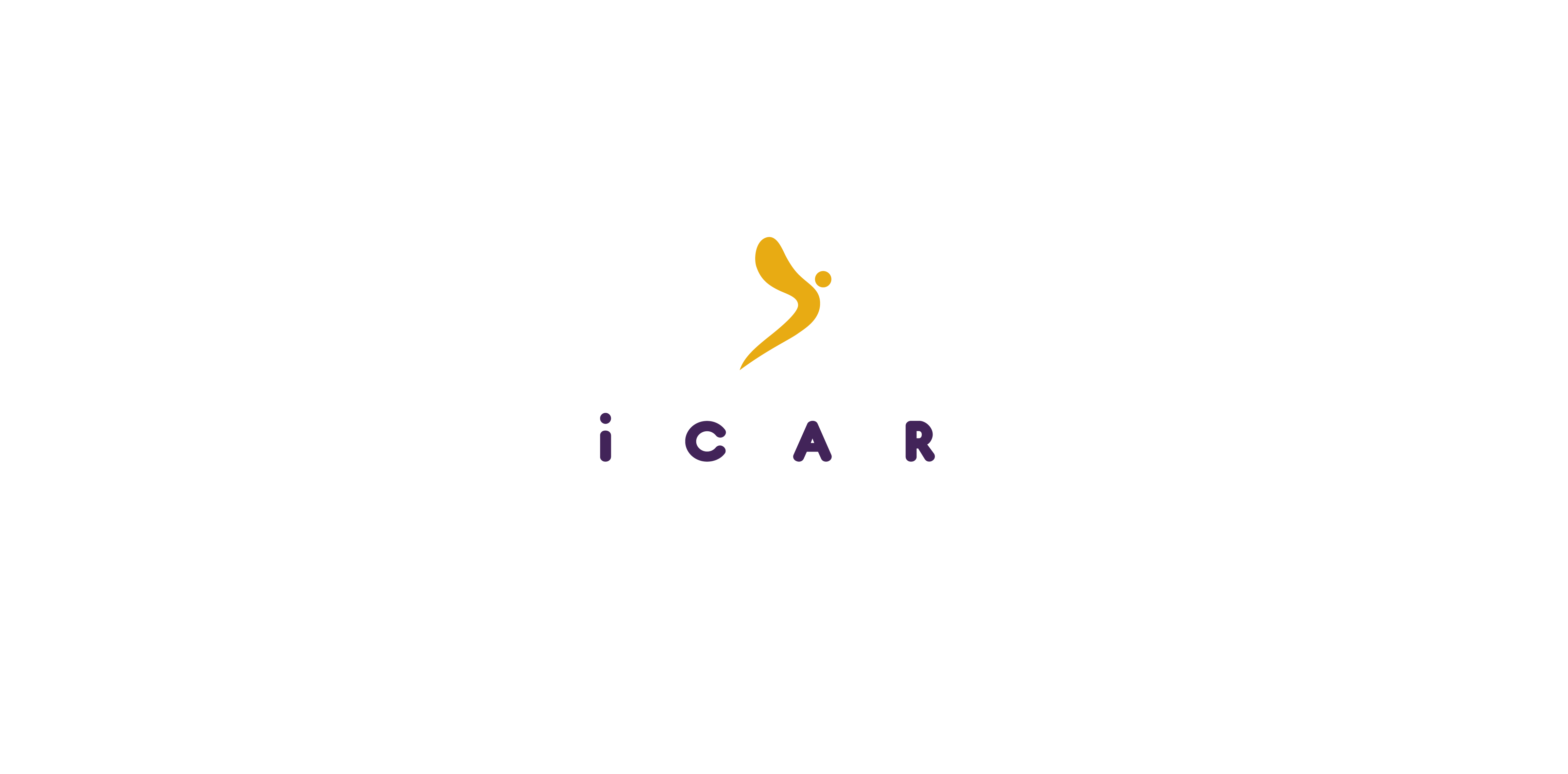
Logo for an inteligent car systems. The name and icon are related with mitological Icarus.
I,m preparing logo for my website and i'm searching for a perfect one ;) I appreciate any advice and opinion

Logo for sea explorers team.

Logo for a make-up artist. Simple junction of a swan (beauty symbol) and an eye (the subject). Also the neck of a swan is shaped into the letter S for Simona.

Logo for a Jazz Club

Triton - mythological half man, half fish. Logo for sea logistic company.

Logo for an audit office. Hope you enjoy it!

Logo for an app for a night time meetings for singles. Heart and owl combined into a map pin.

Logo for a bookstore focused on crime and detective novels.

Logo for a bridge club. Composed with 9's and 6's, together present table with four seats for players.

Logo proposal for a pharmacy. Logo shows simplified mortar with a pestle. What do you think about the concept?
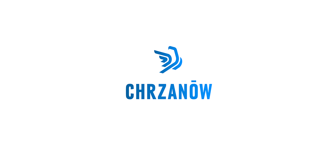
Logo proposal for a town named Chrzanow. The sign is a simplified presentation of an eagle which is most recognizable sculpture on the main square in the town.

Logo for a contest for a logo of Labiszyn. The concept for this logo was to shape the letter 'L' with crossing line (pronounce in polish like W) into a raising bird.

Delivery on bikes. Letter C combined with letter H in negative space.

Logo for a foundation helping save eagles. Hand symbolize help. Thumb is a head of an eagle. Four fingers are shaped in a wing.
Exclusive DECOrations' producer.

Logo that shows that I love parrots in uniforms :)

Logo for a stationary and art and office supplies producer.

Logo for a website that collects orders for webdevelopers to create webpages. Logo shows an announcement stick with an arrow wich is related to medival announcements or orders.
Logo for a contest for Polish Space Agency. Logo shows a planet and arrows as a 'reaching for the stars' symbol. It's dynamic but stable as well. I'd like to show that logo as a tribute to momdernism polish logos from '60, '70 which was very expresive in its form but simple and clean as well.

Logo for Copper Basin Art Exhibition. Combination of an eye and a brush on a canvas.

Logo for downtown bistro.