LogoMoose
  • Logo
    Galleries
    • Featured logos
    • Most rated logos
    • Most viewed logos
  • Identity
    Galleries
    • Featured identities
  • Packaging
    Galleries
    • Featured Packaging
  • Designers
  • Competition
  • Upload
  • Become Member
  • Login

M-STUDIO

  M-STUDIO  
M-STUDIO
Facebook
fb-share-icon
Pinterest
Reddit
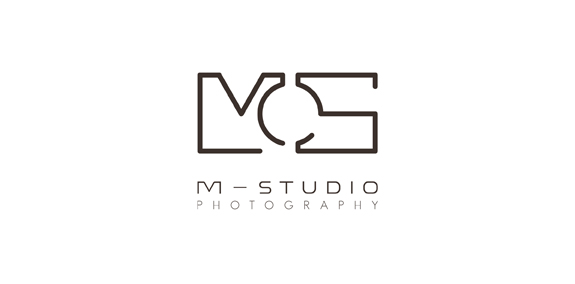
  • Logo designed for private client, who is art photographer based in Poland. M- is from the first letter of the artist name. Logo looks like architectural drawing, because it is supposed to symbolize studio of photography.M-STUDIO Designer: ziemko
  • Submitted: 09/08/2015  •   Featured: 09/08/2015
  • Stats: This logo design has 8271 views and is 0 times added to someone's favorites. It has 7 votes with an average of 3.86 out of 5.
  • architectura
  • design
  • fotografia
  • M-STUDIO
  • photography
  • studio
  Designer  

ziemko

View portfolio

  More logo design  
First avenue

...

smolkinComments0Jun-30-14
Арбат

hyperianComments0Jul-12-09
Судоводитель / Skipper

Logo of blog skippers.

kgComments0Jul-03-12
HVAC

HVAC logo

sadanyComments0Sep-29-17

  About  

LogoMoose is an inspiration and design community that was launched in 2008. It showcases logos, identities and packaging submitted by professional designers, design studios or agencies. We showcase the best work from the best designers from around the globe. Become a member now and create your own portfolio!

Get your daily dose of inspiration to work on your own design projects and get your business moving. Be amazed by our logos, identities and packaging on this worldwide platform. We‘re here to inspire you and help you impress your clients and fellow designers. Get an overview of global trends in logos, identities and packaging. Browse our galleries and discover all the latest design trends.
We know you love your work!

© 2008 - 2026 LogoMoose.com - All logos are property of their respective owners.
FAQ - Privacy Policy - Imprint