

LogoMoose Logo Inspiration
  • Logo
    Galleries
    • Featured logos
    • Most rated logos
    • Most viewed logos
  • Identity
    Galleries
    • Featured identities
  • Packaging
    Galleries
    • Featured Packaging
  • Designers
  • Upload
  • Become Member
  • Login

Perga

  Perga  

Perga
Facebook
fb-share-icon
Pinterest
Reddit
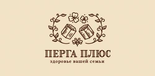
  • Mark concept proposal for small family business Perga+. A company engaged in the bee bread "Perga" production and trade.Perga Designer: Sergey Osokin
  • Submitted: 06/09/2015  •   Featured: 07/08/2015
  • Stats: This logo design has 5443 views and is 3 times added to someone's favorites. It has 11 votes with an average of 3.91 out of 5.
  • bee
  • bread
  • food
  • health
  • honey
  • organic
  • Sergey Osokin

  Designer  

Creold

View portfolio

  More logo design  

Books gives you wings

The logo for this international school, show birds flying to the school - and away from the school. Just as students often do to an international school, because they often have a mom/dad who travels a lot. Books gives you wings.

christianbaunComments0Oct-09-17
Mobi Sock

Mobi Sock is a contemporary styled, rectangular shaped, fabric-knit "sock" with draw string (hence the whale's tail) to protect cell phones, ipods and other mobile electronic devices.

sean-heislerComments2Aug-27-11
Golden Guns

A brand of cowboy boots. Western Boots for women.

mosstroramaComments0Aug-09-16
Lucid Form Architecture

This logo is for a completely fictitious architecture studio called Lucid Form Architecture.

The icon is based on an optical illusion of a cube within a cube. Primarily, the form depicts a big cube, made of wood walls and metal-plated top surfaces, with a notch cut out of the center, resulting in a 3-D "L" shape. However, the longer one looks at this, perception begins to shift, resulting in a couple of different interpretations: 1) a small cube with a wooden wall and metal-plated bottom, in the corner of a room, hovering near the top of a tiled ceiling; 2) a room, tilted 90° clockwise, with hardwood floors, tiled walls, and a cube with a wood countertop and metal-plated side on the floor in the corner. This perception shift is important to the name, because it presents an ironic twist. To make "lucid" means to make clear, and while the icon seems to initially baffle and confuse, it ultimately encourages the viewer to challenge his or her preconceived notions of "perception." So too is the Lucid Form methodology for creating seeming impossible structures.

atomicvibeComments0Sep-17-11

  About  

Logo Inspiration showcases logos, identities and packaging
We are an inspiration and design community that was founded in 2008.
Here, we showcase logos, brand identities and packaging designs created by professional designers, design studios and agencies. We showcase the best work from the best designers from
Join us and upload your work! Register here!

© 2008 - 2026 LogoMoose.com - All logos are property of their respective owners.
FAQ - Privacy Policy - Imprint