

LogoMoose Logo Inspiration
  • Logo
    Galleries
    • Featured logos
    • Most rated logos
    • Most viewed logos
  • Identity
    Galleries
    • Featured identities
  • Packaging
    Galleries
    • Featured Packaging
  • Designers
  • Upload
  • Become Member
  • Login

Humanovation

  Humanovation  

Humanovation
Facebook
fb-share-icon
Pinterest
Reddit
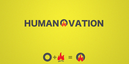
  • Wordmark using the wheel and fire to highlight the innovation part of "Humanovation" Humanovation Designer: LittleGuyLogos
  • Submitted: 03/30/2013
  • Stats: This logo design has 2136 views and is 0 times added to someone's favorites. It has 1 votes with an average of 1.00 out of 5.
  • circle
  • fire
  • LittleGuyLogos

  Designer  

LittleGuyLogos

View portfolio

  More logo design  

Deappetizer.com

Logo was created for site deappetizer.com. Deappetizer.com is for people, who used to eat a lot, but decided to do something to reduce their appetite. Idea is simple and clever in my opinion: the site presents unpleasant pictures, which should spoil your appetite. And before a meal you can visit this site to change your perception of food for a while. All of the pictures are divided into three levels by their effect. The further the stronger. Concept: imagine that «Deappetizier» is very unusual restaurant, where guests come to refrain from eating, so the primary duty of a waiter is not to allow a guest to eat. All the waiter’s efforts to discourage guest’s appetite formed the basis for a series of logos for each level of pictures: Level 1 https://www.logomoose.com/members/alisa1711/showcase/logo/244/ Level 2 https://www.logomoose.com/members/alisa1711/showcase/logo/245/ Level 3 https://www.logomoose.com/members/alisa1711/showcase/logo/246/ Also you can see logo in bigger size and on the white background at http://revision.ru/work/36475/

alisa1711Comments2Dec-15-10
Ocean Life

A mark is a combination of a seahorse, letter O. Some people also see a man's face on a backside of the seahorse.

brandsirrahComments0Apr-19-11
Tapesh Fitness Club

This logo has been designed for a fitness club called "Tapesh". Tapesh in Persian means heartbeat. I used an image of a pulsation of heart combined with the name of the club.

samanehComments0Jul-10-12
Mikos

tommeComments1Oct-12-10

  About  

Logo Inspiration showcases logos, identities and packaging
We are an inspiration and design community that was founded in 2008.
Here, we showcase logos, brand identities and packaging designs created by professional designers, design studios and agencies. We showcase the best work from the best designers from
Join us and upload your work! Register here!

© 2008 - 2026 LogoMoose.com - All logos are property of their respective owners.
FAQ - Privacy Policy - Imprint