LogoMoose Logo Inspiration
  • Logo
    Galleries
    • Featured logos
    • Most rated logos
    • Most viewed logos
  • Identity
    Galleries
    • Featured identities
  • Packaging
    Galleries
    • Featured Packaging
  • Designers
  • Upload
  • Become Member
  • Login

Pitch

  Pitch  

Pitch
Facebook
fb-share-icon
Pinterest
Reddit
  • Logo for Pitch communication & prPitch Designer: Marc
  • Submitted: 01/13/2012  •   Featured: 02/10/2012
  • Stats: This logo design has 5701 views and is 0 times added to someone's favorites. It has 4 votes with an average of 3.25 out of 5.
  • Marc
  • the goodplace pitch

  Designer  

Marc

View portfolio

  More logo design  

Curious Alice in Wonderland

‘Curious Alice In Wonderland’ are a start-up London based business who sell erotic books and literature, as well as being a community who offer regular book clubs and events for women. The companies ethos and tagline is ‘Curious Women Unleashing Taboos. Open Talk. Friendly Events’

Although designed for a erotic led company it was essential that the logo design target professional, respectable women from the age of 24 onwards, as well as promote a trustworthy quality business with excellent customer service, providing luxury products beautifully wrapped, and delivered on time.

The decision was made to play on the white rabbit theme from the Alice in Wonderland stories. Where does the white rabbit take Curious Alice as she grows into an adult? Continuously, and playfully running ahead throughout her life. A playful, yet elegant font was crafted to compliment the icon. The final logo is presented below.

For more information visit: http://logogeek.co.uk/?portfolio=curious-alice-in-wonderland-logo-design

logogeekComments0Apr-25-14
Hotspot BBQ Team

actiondesignerComments1May-21-10
Delfex

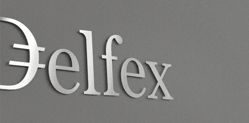
Logo and corporate identity for company trading with foreign currency. I was working on this project last two month. I made for client whole identity set from logo design, stationery design, web design with programming part, copy-writing including slogan and finally design manual. Logo on this photo is mounted in headquarters office on a wall. It was carved out of brushed aluminum plate to gain metallic look which is symbolic interpretation of currency, money and prosperity. Metallic effect literally connects whole identity. All stationery is printed by PANTONE 811 C metallic silver color. For selected materials such as business cards, compliment cards, envelopes and documents folder was used special silver metallic paper.

janzabranskyComments0Jul-11-11
Wood Buffalo

Fast paced temporary staffing firm working primarily in the oil industry

jackieComments0Jun-30-14

  About  

Logo Inspiration showcases logos, identities and packaging
We are an inspiration and design community that was founded in 2008.
Here, we showcase logos, brand identities and packaging designs created by professional designers, design studios and agencies. We showcase the best work from the best designers from
Join us and upload your work! Register here!

© 2008 - 2026 LogoMoose.com - All logos are property of their respective owners.
FAQ - Privacy Policy - Imprint