Matchwing
Matchwing


- Logo description: A Web design (graphic, 2d animation) company logo.
Design based on simplified graphic of matches to form "M" which it
also look like circuit which represent web solution. The side of the
"M" is in spread out form, which similar shape like wing.
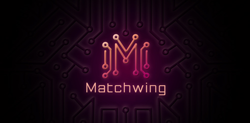 Designer: Gary Chew
 - Featured: 12/13/2010
- Stats: This logo design has 26779 views and is 0 times added to someone's favorites. It has 26 votes with an average of 3.35 out of 5.