2017 logos (953)

*


Papa is a little coffee shop in Ho Chi Minh City, owned by Vietnamese family siblings. Papa means “father”, so the interiors are inspired by their father’s familiar items and they also bring his favorite flavour into Papa’s drinks, which is their pride. Besides that, raw materials are carefully selected from Dalat, where fruits are fresh all year around. Papa’s logo shape is the image combination of their father’s top hat, his beard and a cup of coffee. More at: www.behance.net/gallery/35121837/Papa-Coffee-and-Furniture

Farowind concept / www.nlogo.pl


http://wp.me/s4571j-corecode

Nugat Travel -- http://www.nlogo.pl/portfolio/nugattravel
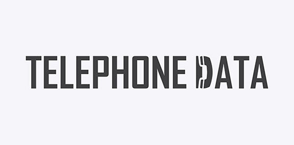
A no-nonsense sans serif font sets a professional tone for Telephone Data's logo, but one letter contains a surprise—the "D" is shaped like a phone.
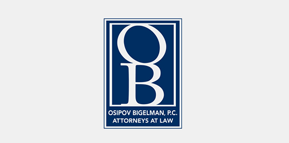
Dark blue and white color branding give this law firm's logo an elegant look. The OB monogram creates an easily recognizable symbol, while the text below it spells out Osipov Bigelman, P.C.'s full brand name.
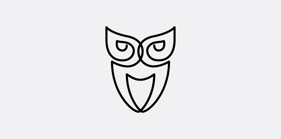
Owl Logo Concept: Drawn using a single line.

A logo design for anti-spyware, anti-virus, security agency, safety equipment and other security related services and products.
The Other Side logo

Like us on facebook: www.facebook.com/hunapstudio

Logo for a T-Shirt shop based in Da Nang - Viet Nam

Horvat residence - H represent traditional wooden raft because owner want to implement the rafting history of his great grandfather in to the logo.

A beautiful flower woman emerging from within a garden. The woman’s figure is created with natural vines that flow seamlessly to creative the impression of the woman’s figure. Her arms create the leaves with her head designed to look like an open blooming daisy flower. https://www.logomood.com/downloads/grand-daisy/

oft flowing and airy lines create the impression of a running fox animal. The fox is designed with streaming lines, which create the feeling of the wind blowing as well as the running movement of a fast fox running through the lush forest. Leaf elements are naturally placed throughout the design to add a natural flair to this unique and elegant fox logo. https://www.logomood.com/downloads/windy-fox/

Contest for a gardening's company
"Ferona" (fertility clinic)- logo.

ozone logo
From my "Crow" logos collection. #I