2016 logos (1159)
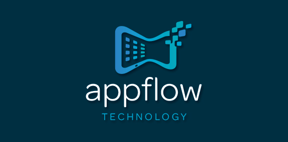
Modern, organic shaped, uniquely designed smart tablet logo, incorporating the idea/concept of tablet apps in motion. This tablet logo design is created with a warping effect that represents data transfer and app interaction. The squares on the tablet warp inward flowing seamlessly within the design and the pixels flow outward to represent transfer of data and communication. https://www.logomood.com/downloads/app-flow-technology/


fence+pencils=fencils

Hilgrup is a Ukrainian company which specializes on the development non standart products & solutions. Labyrinth symbolizes one of the most famous task.

A logo to promote the use of electric/clean vehicles.

Badge design for a camping trip I organized with a few friends. Had some extra time at work, so I put this together for fun!

Three representing the mind and shovel representing the digging

a fish shaped logo which looks like is made of a paper strip folded to form the shape.
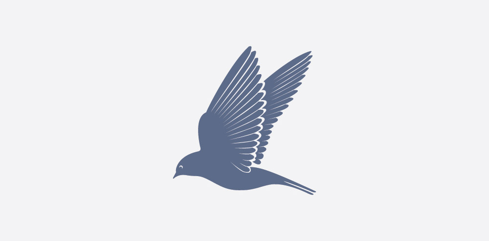
A bird who travels long distances.

Negative space logo design

Logo for a music purpose

Logo was created for Slovak yoyo nationals in 2014.

El concepto se trabajó en base al ‘’Pin’’ de ubicación, esto refiere a la búsqueda de un lugar. El triángulo inconcluso representa el techo de una casa, que también connota una flecha. Al juntar estos elementos se genera la idea que el hogar es donde todos llegamos.
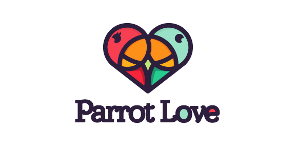
Parrot Love
LOGO FOR SALE (e-mail: kacper@x-mind.pl)

Voip.

Logo for cat care company
Logo for a coffee shop

Logo created for a blog dedicated to information sharing.

I have a personal interest in Viking/Norse history and lore, so that's where the name and design comes from. Now when we think of Norse/Vikings, a lot of us jump to Thor or even Odin, however Tyr, the god of law and heroic glory, is arguably older and potentially historically more important than either of them. While in the lore, he is the son of Odin, his name originates further back as it literally translates into "God". This means he may have been one of the very first Norse gods ever conceptualized. His importance became engraved in our day-to-day lives without anyone realizing it; a day of the week was named after him. That very day, would be Tyrs-day, also known as: Tuesday. In Norse mythology there was a wolf named Fenrir, who was living among the gods and it was said by the Norse that he would one day turn on the gods. In order to prevent this, they chained him up, promising to eventually release him. Not wanting to be seen as a coward, Fenrir resisted, but agreed to it as long as someone put a hand in his mouth as a pledge of troth. As none of the gods wished to lose their hand, Tyr stepped up and offered his. He in turn lost it, but Fenrir became chained up and unable to harm the others. So in short, the God of law sacrificed his arm for the sake of others. Followers of Tyr are asked to enforce justice in their lives while keeping an open mind to both sides of the situations, and if you know me, you'll know that I'm a firm believer in that there are two sides to every coin and that I rarely jump to conclusions based on what one side said. I hold those values close to me, so upon reading about Tyr, it rang close to home and I took a great interest to it. "True justice is served not by letting violent emotions rule our actions, but by binding the violence both in ourselves, and in that which threatens the justice and peace of our world." So why didn't I use Tyr specifically in my logo? While I didn't use him explicitly, I did use Fenrir, the beast he had to tame in order to secure the safety for everyone else. I took it as a metaphor as what I believe in - sacrificing yourself or your interests for the prosperity of those around you. That's what the wolf in my logo represents, the fear you face in the times of great, but needed, sacrifice. So no, it is not Tyr himself, but rather a representation of what he stands for and stands against.

Logo for jewelry manufacturers.
It's a jungle leaf :0 My best logo so far!

Logo designed for Muslim Writers Guild of America. Its declared mission statement is to "respond rapidly to media coverage of Islam through letters and editorials", and also to "respond systematically to critics of Islam through scholarly rejoinders", defending "the honor and sanctity of Islam by waging a 'jihad of the pen'".