March 2014 logos (99)

896 ambigram symbol for knitting company.


A simple logo from clear message. An ice cream cone formed by the play button and a reel. Used primarily for agencies working in the cinema. Easily reproducible and scalable without losing the detail.

Logotype for shop with clothes for kids. Modny = fashionable Dzieciak = kid, bab

This was created for a series of audio and video workshops for children and teenagers.

Logo designed for a new company, an academic service provider.
Hekademia is an archaic Greek name for the land that contained a sacred grove of olive trees dedicated to Athena, goddess of wisdom. It is the place in which Plato built his school of philosophy. The logo needed to reflect this theme and include an olive or olive tree reference.

This restaurant use organic materials and Ova means Plain in Turkish...

Logo for media production company.
This logo was made for a blog that is about giving tips on how to fall asleep and how to wake up early.

Logo/identity including slogan for Motion Birth designed for Werox, Sweden.
Motion Birth is visualising various life science areas through motion graphics.
The logo is inspired by the science areas Motion Births motion graphics are made for. It has a resemblace to star clusters in a spiral galaxy and molekules in a DNA string.
The logotype is custom-made

Интернет магазин распродаж одного товара в день с очень большими скидками. концепция: настолько низкие цены, что иначе, чем "кражей" это не назовешь )
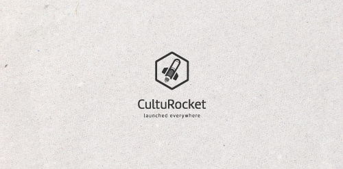
A well proportioned logo. A book used as a rocket to spread the culture. The slogan is very impressive "launched everywhere." Easily reproducible and scalable.

logo concept for film/ad production setup.

Designer: Denis Aristov | Client: ISOCARP | Industry: Event, Congress | Keywords: 48th ISOCARP Congress Perm – Fast Forward: Planning in (hyper) dynamic urban context
PROJECT Panax Pharma is Czech based distributor of medicines and pharmaceuticals. I was asked to create simple and distinctive visual identity including logo manual and stationery. CONCEPT The logo contains stylized illustration of medicine mortar - traditional tool used for pharmaceuticals production and processing. The mark is reflecting susceptible and responsive approach of company through subtle rounded stylization and refined execution of it's design. Negative space used in illustration of the mortar also inspires emotions of preservation and processing content from out. Finally Optima typeface with turquoise and silver color palette completes company corporate identity design basics.

The folk collective, who song and dance ensembles coming from warmia - in the Warmia and Mazury region of nothern Poland.