2011 logos (2091)

Logo for a Dutch wakeskating team.. © Gert van Duinen | cresk design


High end real estate agent. This concept speaks to the nationality of the agent.
This logo was created as a personal brand mark for Geoff, to represent him as a graphic artist. This typographical solution was inspired by the 17th century Romaine du Roi, which features a serif face with its underlying structure. This mark was used previous to the Geoff Matheson Studio "G splat" and is no longer in use.
This logo was created for a collaborative social network project, Organism. The icon represents people networking together to create a larger network, and these networks working together - communicated through the graphic of gears made up of abstract people. Visit www.groworganism.com to learn more.

Company sphere of activity is medical equipment and services.

Law company The number 1 is used in the letter P as a negative space.

Proposed concept.

Proposed logomark to a financial advisor.
The new logo proposal for Monarch Bath Pvt. ltd. Monarch bath Pvt. Ltd. has various models active in the collections o f bathroom fittings and sanitary wares and regularly adds several new designs and brands to the product portfolio. The Company has also an exclusive range of sanitary ware to offer with a very wide choice in designer bathroom sets, wash basins, bathtubs and related items.

Handmade Fair ;)

Ladies and gentlemen, the one and only, mysterious Fantom!

Work for interactive agency. Formiko means an ant in Esperanto. So it was a simple task - all Mootto had to do was to find an ant and draw it as close to the original model as possible. This is what an average ant in Mootto world looks like.
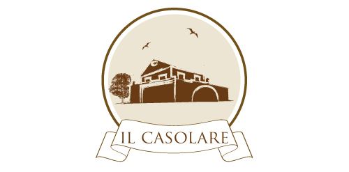
Logo di un agriturismo. Lavoro svolto da Mike Iasalvatore.
logo done just for fun
The new logo proposal for Monarch Bath Pvt. ltd. Monarch bath Pvt. Ltd. has various models active in the collections o f bathroom fittings and sanitary wares and regularly adds several new designs and brands to the product portfolio. The Company has also an exclusive range of sanitary ware to offer with a very wide choice in designer bathroom sets, wash basins, bathtubs and related items.