2011 logos (2091)
Directional arrows representing motion also form an 'M' in negative space.


Identity for a small design bureau in Ulm (Germany).

cafe
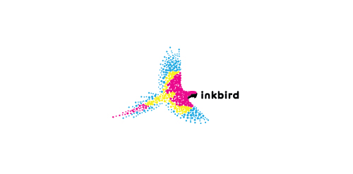
A bird made up of the colors cyan, magenta, yellow, and black to represent a printing company.
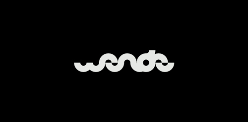
Personal logo for me as a designer. The typography is just build from a simple half circle. The "W" can also be used as a standalone icon which is also a pair of eyes.

it is an anti logo for an up and coming t-shirt design company
New Logo proposal for an events and media company in Dubai.

Online shop for golf equipment. Kewl/cool golf symbolized with two golf clubs which are also sunglasses.

Q3 Marine Training Solutions
Logo for my art & design studio.
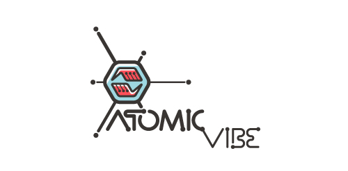
I define ATOMICvibe as the "a-HA!" moment of clarity in the creative process. Like nuclear fusion, it's when tiny ideas coalesce, and then explode into beautiful design.
The logo visually depicts this creative reaction. Forming abstract A & V shapes, the converging hands cradle the tiny beginnings of a big idea, fusing them until they discharge a shockwave of creativity. The custom type, designed to perfectly integrate with the mark, is meant to symbolize electron paths. Heavily inspired by retro imagery from the Atomic Age: science, the Space Race, Sputnik, the iconic George Nelson Ball Clock.
Click here to see the case study for this logo, which chronicles its development, and includes full design rationale, sketches, electronic roughs, and alternate designs.
My initials as a logo. Are any of my attempts any good?
My initials as a logo. Are any of my attempts any good?
My initials as a logo. Are any of my attempts any good?
My initials as a logo. Are any of my attempts any good?
My initials as a logo. Are any of my attempts any good?
My initials as a logo. Are any of my attempts any good?
My initials as a logo. Are any of my attempts any good?
My initials as a logo. Are any of my attempts any good?