December 2011 logos (174)

Logo SONIC. take a look for Sonic brand identity on Behance. www.behance.net/gallery/Sonic-Corporate-Identity/2742871


Hands and leaves in negative space.


logo made for software development company

shoe store

Visual identity for a group of web solutions that held by ambitious Saudi girls. Check the full project on: my fan page: http://on.fb.me/uPzw4O my website: http://bit.ly/vCPjNV

Almadeniet — creative city
concept

For a creative design agency.The logo is the letter C formed in the shape of a butterfly wing.

The company - a developer, maker and seller of desktop wargames and boxed games.
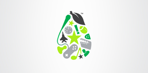
Pear is a cloud-based application that integrates entertainment, fashion, travel and sport. Allowing users to have a customised interface to the web that streamlines and aggregates only what interests them. The logo encompasses representative icons from various genres and sectors and combines them under one pear-shaped roof, just like the app itself.

This concept is based around a simple typographical focus on the RSSA acronym. The Society’s diverse scientific interests helped to form this visual approach, ie deliberately avoiding reference to any particular field with a recognisable visual. The intention was to provide a current day sensibility regarding identity design and construction, in combination with more traditional styling for a long established scientific body. To aid this desire, a modern serif was chosen as the primary font and a secondary sans serif for the tagline versions. These fonts were chosen as a combination for their ability to convey this future/past feel. The icon structure has the added effect of allowing the reading of ‘RS’ & ‘SA’ in either direction, and utilises the Society’s formation date within the design, as it adds historical weight and relevance, plus is also a small visual indicator regarding who and what the RSSA represents.

ejo for man

Photographer