July 2011 logos (190)

security & detective agency


Developed for a series of self-enrichment events entitled "Choose Love," this logotype was created to be instantly recognizable, whimsical, and inspirational. By stacking the eventʼs name and carefully editing key letterforms to maintain legibility, a heart appears to connect the words ‘choose’ and ‘love,’ bringing emphasis to the eventʼs mission.
The Choose Love experience combines a variety of creative exploration sessions, guided meditation, and yoga to help participants gain personal insight. The visual campaign included the development of the Choose Love brandmark, promotional poster, and event branded buttons distributed to participants.
© Keith Kitz, All rights reserved.

Place for little artists, scientist and fun lovers.

Firebrand is a Christian church.

Assembling of excavators

Huge Movie Box. High quality. Huge Collection

logo for a female apparel online store.. a custom type arrangement..

Logo for spin-out company dedicated to the professional preparation of EU projects. Logo symbolizes letter F and man raising hand.
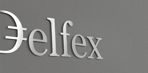
Logo and corporate identity for company trading with foreign currency. I was working on this project last two month. I made for client whole identity set from logo design, stationery design, web design with programming part, copy-writing including slogan and finally design manual. Logo on this photo is mounted in headquarters office on a wall. It was carved out of brushed aluminum plate to gain metallic look which is symbolic interpretation of currency, money and prosperity. Metallic effect literally connects whole identity. All stationery is printed by PANTONE 811 C metallic silver color. For selected materials such as business cards, compliment cards, envelopes and documents folder was used special silver metallic paper.