Wood logos (47)

This logo is for a completely fictitious fish market.
The idea came to me when I discovered that it was possible to achieve a fish shape in the negative space within the bowl of the number 5. Dubbing my hypothetical company Pier 5 Fish Market, I created this illustrative mark in the hopes of really capturing the spirit of the nautical and maritime aesthetic. Type is custom for "Pier" and also the number 5, which is hand-rendered to look like it was painted on a wooden sign with a very wide, worn-out, thick-bristled brush. While it was important for the fish to show in negative space, it needed to look like a seemingly happenstance result of logical, real-world brush strokes. This is the minimal, alternate version of this logo.
Click here to see the case study for this logo, which chronicles its development, and includes full design rationale, sketches, electronic roughs, and alternate designs.


shopping bag + wood log

FOR FUN:))) | NOT FUNNY:)))

- Consulting on foreign investment in Ukraine support investment processes - Energy projects based on the theme of green energy, solar, wind, biomass - Woodworking, wood processing factory with export to the West

Furniture online shop.

Russian company engaged in the construction of wooden cottages and baths.

Logo design for the Casual Pint, a craft beer market

Logo for carpentry company. Saw blade transformed in to ornament pattern.

Jewelry company

Construction of wooden houses

KARELIA group is the importer of wood from Russia

Logo for furniture makers. The concept is wood shaving from ex. a wood chisel creating the letter Ø. Woodcut style illustration so the details will be visible when etched or burned into wood.

This logo is for a completely fictitious fish market.
The idea came to me when I discovered that it was possible to achieve a fish shape in the negative space within the bowl of the number 5. Dubbing my hypothetical company Pier 5 Fish Market, I created this very maximalist and illustrative mark in the hopes of really capturing the spirit of the nautical and maritime aesthetic. Type is custom for "Pier" and also the number 5, which is hand-rendered to look like it was painted on a wooden sign with a very wide, worn-out, thick-bristled brush. While it was important for the fish to show in negative space, it needed to look like a seemingly happenstance result of logical, real-world brush strokes. In the full lockup, the addition of the life preserver takes less emphasis off this gimmick, allowing one to slowly discover the fish.
Click here to see the case study for this logo, which chronicles its development, and includes full design rationale, sketches, electronic roughs, and alternate designs.
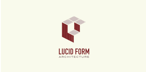
This logo is for a completely fictitious architecture studio called Lucid Form Architecture.
The icon is based on an optical illusion of a cube within a cube. Primarily, the form depicts a big cube, made of wood walls and metal-plated top surfaces, with a notch cut out of the center, resulting in a 3-D "L" shape. However, the longer one looks at this, perception begins to shift, resulting in a couple of different interpretations: 1) a small cube with a wooden wall and metal-plated bottom, in the corner of a room, hovering near the top of a tiled ceiling; 2) a room, tilted 90° clockwise, with hardwood floors, tiled walls, and a cube with a wood countertop and metal-plated side on the floor in the corner. This perception shift is important to the name, because it presents an ironic twist. To make "lucid" means to make clear, and while the icon seems to initially baffle and confuse, it ultimately encourages the viewer to challenge his or her preconceived notions of "perception." So too is the Lucid Form methodology for creating seeming impossible structures.
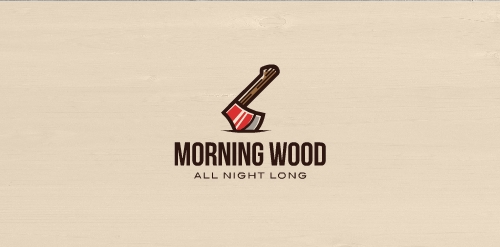
Morning Wood is a sexual enhancement drug aimed at men between the ages of 18-35.
Furniture exhibition "Russia-Asia: Technologies of an interior"

Producer of timber houses.
The client wanted to emphasize quality, nature, beauty, uniqueness, trust and avoid references to traditional symbols (roofs, doors, windows, buildings) used within this industry.