
Texture logos (17)
Logo process and branding: https://www.behance.net/gallery/31767063/Peaceful-Bay-Logo-Branding A wine company requested a logo that would represent Peaceful Bay a region located in a South -West Australia. Doing some research, I found out that whales visit the southern Ocean, a great symbol for the label and name. After multiple sketches this is the final result.


Logo Design for UPA — Urban Planning Architecture — www.vasilenev.com — #vasilenevdesign — #vasilenev
"Textures from all terrains." Logo designed for a new texture database website. Where print & web designers can download images for no charge.

This is a logo for a beauty salon, which focuses on quality beauty treatments.

Its an "I". Its a 3D logo.
This logo is for a completely fictitious fish market.
The idea came to me when I discovered that it was possible to achieve a fish shape in the negative space within the bowl of the number 5. Dubbing my hypothetical company Pier 5 Fish Market, I created this illustrative mark in the hopes of really capturing the spirit of the nautical and maritime aesthetic. Type is custom for "Pier" and also the number 5, which is hand-rendered to look like it was painted on a wooden sign with a very wide, worn-out, thick-bristled brush. While it was important for the fish to show in negative space, it needed to look like a seemingly happenstance result of logical, real-world brush strokes. This is the minimal, alternate version of this logo.
Click here to see the case study for this logo, which chronicles its development, and includes full design rationale, sketches, electronic roughs, and alternate designs.
Logo for my friend's business.

Art projects using toothbrushes.

Submission for a contest.

Redesign personal logo

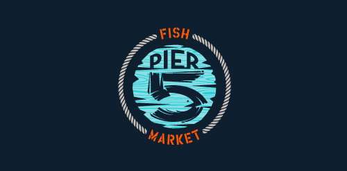
This logo is for a completely fictitious fish market.
The idea came to me when I discovered that it was possible to achieve a fish shape in the negative space within the bowl of the number 5. Dubbing my hypothetical company Pier 5 Fish Market, I created this very maximalist and illustrative mark in the hopes of really capturing the spirit of the nautical and maritime aesthetic. Type is custom for "Pier" and also the number 5, which is hand-rendered to look like it was painted on a wooden sign with a very wide, worn-out, thick-bristled brush. While it was important for the fish to show in negative space, it needed to look like a seemingly happenstance result of logical, real-world brush strokes. In the full lockup, the addition of the life preserver takes less emphasis off this gimmick, allowing one to slowly discover the fish.
Click here to see the case study for this logo, which chronicles its development, and includes full design rationale, sketches, electronic roughs, and alternate designs.
Logo for the Dutch Multiple Sclerose Classic Car Rally.