
Sweet logos (28)
A logo for company for sweets.


A cake that is made to look like an angry monster. Logo design is available for sale!
A delivery bus that is made to look like a cake. Logo design is available for sale!
Sweet Siren is company that sells handmade soap and body pearls for women.

Cake company based in Krakow
Logo for a line of products for adolescent and young adult audiences. The main concept is to design a sustainable brand that can introduce many products. The mark is mainly inspired by the shape and color of the feature product of the company, the molly pop, a fashionable candy.

Just for fun

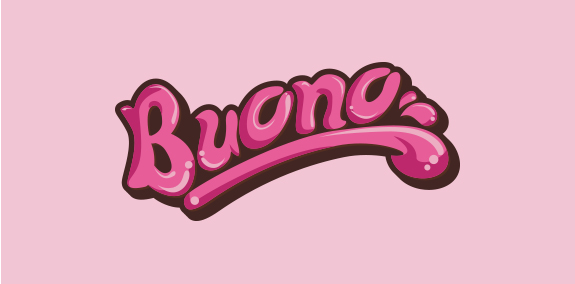
Wordmark design. Custom lettering
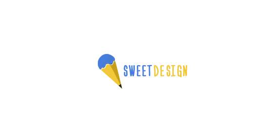
A sweet design is a good design
.

Brand for any kind of studio with a lot of creativity. A funny way to approach the job.

A quirky font and soft colours combine to make this childish sweet logo. Perfect for a candy shop!

Ready made logo design.

Naming & logo for boutique cake bakery.
Typographic logo design.

logo for a drink store

Childcare center

This logo for baby textile products.

This logo is all about chocolate! A simple silhouette but a clear statement for those who love chocolate in all its forms.

Creative logo that illustrates the product branding.