Red logos (230)
Logo for my art & design studio.
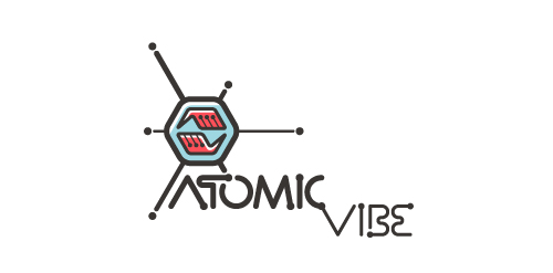
I define ATOMICvibe as the "a-HA!" moment of clarity in the creative process. Like nuclear fusion, it's when tiny ideas coalesce, and then explode into beautiful design.
The logo visually depicts this creative reaction. Forming abstract A & V shapes, the converging hands cradle the tiny beginnings of a big idea, fusing them until they discharge a shockwave of creativity. The custom type, designed to perfectly integrate with the mark, is meant to symbolize electron paths. Heavily inspired by retro imagery from the Atomic Age: science, the Space Race, Sputnik, the iconic George Nelson Ball Clock.
Click here to see the case study for this logo, which chronicles its development, and includes full design rationale, sketches, electronic roughs, and alternate designs.


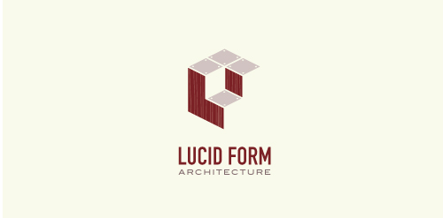
This logo is for a completely fictitious architecture studio called Lucid Form Architecture.
The icon is based on an optical illusion of a cube within a cube. Primarily, the form depicts a big cube, made of wood walls and metal-plated top surfaces, with a notch cut out of the center, resulting in a 3-D "L" shape. However, the longer one looks at this, perception begins to shift, resulting in a couple of different interpretations: 1) a small cube with a wooden wall and metal-plated bottom, in the corner of a room, hovering near the top of a tiled ceiling; 2) a room, tilted 90° clockwise, with hardwood floors, tiled walls, and a cube with a wood countertop and metal-plated side on the floor in the corner. This perception shift is important to the name, because it presents an ironic twist. To make "lucid" means to make clear, and while the icon seems to initially baffle and confuse, it ultimately encourages the viewer to challenge his or her preconceived notions of "perception." So too is the Lucid Form methodology for creating seeming impossible structures.
CardFaves.com is a business card inspiration website. They showcase the best business card designs from designers worldwide.

A yacht detailing business.
Logo for an URL shortening service. "Legível" means "legible" in portuguese.
Logo Design for a high-end residential contractor based in Colorado.

.

.
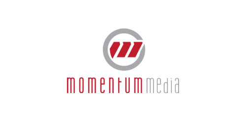
New identity for Momentum Media, a small video production company in Seattle.

Unused concept for client. I used the negative space to make the cross between both dogs. And I made a custom font for the text.

Restaurant
Completely handwritten logo type for Haarlem (The Netherlands) based communication agency. The letter 'o' consists of a subtile heart.

Zodiaq is the furniture company. The main thing that differs it from other companies is that it produces furniture for individuals and it also uses expensive stone. The logo is strong, serif font that represents high status.