Logo logos (1957)

my personal logo "chameleon.design", black-white. Chameleon likes pencil :)


This a logo for new brand named by "Adidas liquid", concept and design by Mohammad AL Bardan | Art director, the idea was to preserve the spirit of the original adidas company logo and point out the identity for the new brand, as you see i have made it simple and elegant so i just transform the three slashes for the original logo from the solid to the liquid pretty simple and to the point, :) what do you think?.
logo i use to represent myself all over the web. hope you like it.

An "Alpha" letter which contains a storm inside ,to represent the company name (Alpha Storms)

Frozen yogurt shop in Macau. At first, we had tried to go with something more gentle, smooth and subtle (to match yogurt`s creamy texture), but it turned out that the client prefers a heavier, less refined approach.
This is a design based on client`s own sketch.

Prince's Foundation for perfumes and cosmetics

A logo for a real estate agency. Abstract and modern design was required.
made for fun but evolved from a serious project... :)

Logo looks like mamuth and associate with letter M.
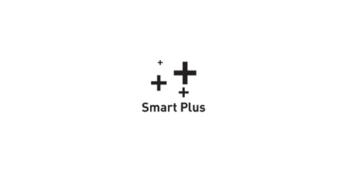
Play the negative space with the letter of "S" and the icon of "+" to be the logo.
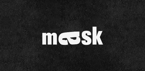
Mask | Playing With Type. Rotation of the letter "a" to form the mask (for those who have not noticed)
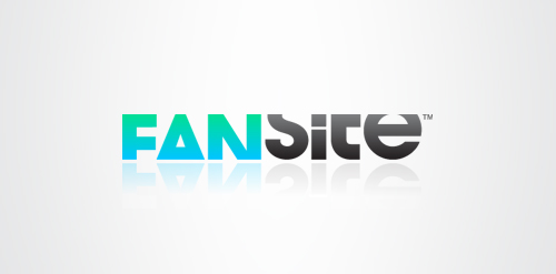
Fansite is a modern, digital equivalent of a fan scrapbook or fanzine; a social network for fans to get together, discuss and swap content based on their favourite celebrity. The typeface selected is modern and has a strong relevant personality itself, but it is treated in a unique way. Each letter is tightly cropped, yet still legible, inspired from old fanzines when fans would use scissors to cut and layout their magazines. This modern, digital equivalent creates a unique and memorable logotype.

My personal identity. A N&H monogram.

Logo for a local software and app development company.