Graphic logos (101)

The main idea of the project was inspired by the contrasting colors of the flags of the two countries and the peculiar characteristics of their respective cultures. States, its elements create a unique and harmonious to symbolize the association between these two peoples.


PIMP Agency Communication


Logo Petits Pas. Firm for kids shoes

Logo Nike Air
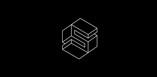
isometric logo S inspiration M. C. Escher

The artistic design of this logo prized by the importance of the surname "Moura", whose initial is graphically represented by film tape on a background (perhaps a pattern shown on screen). The colors have no meaning aparento therefore were chosen according to personal taste.

"Raízes" ("Roots" in English) is a segment for training and distribution of products and services based on Multi-Level Marketing. The name was chosen due to the characteristics of biological functioning of the body's most important tree: the root, the stem laying on the ground and transports nutrients for their survival. These are also the characteristics of this segment: fix market, providing ways of working and bring products from their suppliers to the attention of the population, as a large tree attached to the ground, beyond that required for the ecosystem, offers plenty fresh who are in need.
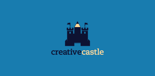
Logo proposal for a webdesign agency. Inspiration: a castle which instead of a middle tower has a pen pointing up.

"O Rei do Cangasushi" logo is a prototype for a probable sushi bar in Brazilian northeast. The artistic design was entirely based on the figure of "Virgulino Lampião", the legendary king of the outlaw (outlaw means "cangaço" in portuguese), folk hero. A slice of salmon above the rice cake represents the typical hat of outlaws (outlaws means "cangaceiros" in portuguese) led by "Virgulino Lampião" (who wore glasses and had a blind right eye) at that time and today is considered the symbol of the Brazilian northeast.

Yuuhakkan Dojo, which means "cross swords among friends," is a group of friends who meet regularly to practice Kendo. With the opening up this community to new members, it became necessary to create an image to represent them. The artistic design was entirely based on Japanese heraldry, through the use of pre-established concepts (friends + cross swords) in a unique way called Kamon (crest Japanese). The helmets Kendo in continuous circle represents the never-ending friendship through martial art. In the center, in a very delicate way, there is a flower formed from the touch of the tips of bamboo swords used in training. However, the logo has several flowers of different ways. They also represent the monentos only experienced by the group.

"Abordo Psicologia" (Aboard Psuchology) is a group of debates about psychology conducted periodically in the State of Alagoas, Brazil. The logo was developed almost from the Greek letter "psi" (Ψ), universal symbol of psychology. The term "Abordo" in Brazilian Portuguese sounds also like to approach (talk about a topic). In short, it is as if the participants of the group discussions were aboard the boat of psychology to navigate through their areas of expertise - this is the purpose of this logo.

Concept of naming and logo for graphic studio.
Logo design for Impact Pharmaceuticals.

5x9cm is an online graphic design studio specializing in creating economic and different business cards for personal or professional use. The idea of this brand is the concept "communication in small steps", where the arrows formed by "5x9cm" (size of a business card in Brazil) symbolize the exchange of information through interpersonal contact. The contrast generated between the terms "5x9" (large) and "cm" (small) also reinforces the concept adopted.

My personal logo for my graphic creations.

Designed for Pedro Rocha, Academic of Law in Brazil in 2012

Designed for psëkimg, Art Director & Designer in Brazil in 2012
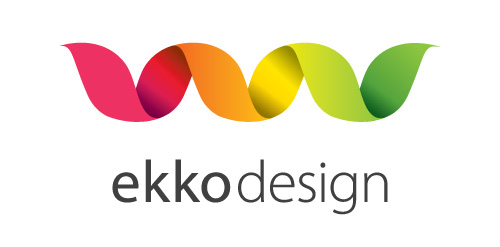
A logo for a webdesign business in Norway. "Ekko" means echo. Clean, simple and elegant logo.
Logo for my design studio. Rode is croatian for stork!