Geometry logos (15)
Science and Business Centre ''Żak''. The largest network of post-secondary school in Poland. / www.zak.edu.pl


A brand identity for a local distributor of accessories and fittings for all types of aluminium and PVC apertures. The brand needed to communicate the feeling of quality at the right price. We came up with the letter F represented by the fibonnaci spiral showing continuity.
Geometry forms exploration. // www.pacholczyk.co
Abstract Logo

One of the brand marks I’ve done at the end 2015. „N” for clothing company from Chile. // www.dominikpacholczyk.com

Monogram8
Latest work
one more reuopload.

IZO concept
Webdesign, architectural visualisations, brochure design.

AuLeon is an unused concept which means Gold Lion. The hexagonal shape represents strength and security. Logo and domain are for sale.
PRA in English means PRE or before. The logo reflects the company's commitment to details from the early stage of design process. The logo shapes and typo constructed from a specific grid system (that later used as a graphic element) and also suggest perspective. Positive and negative space.
Logo for geodetic company in Czech rep.
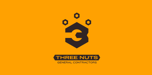
This logo is for a completely fictitious entity named Three Nuts General Contractors.
The idea for this brand came to me when I was out and about in the world, and saw a contractor's work van drive by. As I looked at the number 3 in the telephone number on the van, I started thinking about how a cleverly constructed 3 could reveal a wrench in negative space.
Using a hexagonal bolt nut as my main source of inspiration, I thought of a whimsical name which would support the concept I had in mind. In this hypothetical situation, the "Three Nuts" could be a team of three general contractors.
The icon is built from the angles of the bolt nut, and the entire mark should evoke a heavy industrial feel; something that could be stamped into metal, etched into wood, or simply affixed on the side of a work van.
Click here to see the case study for this logo, which chronicles its development, and includes full design rationale, sketches, electronic roughs, and alternate designs.