
Geometric logos (54)


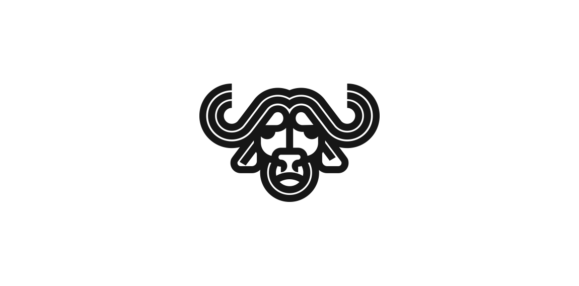
Minimalist and geometric logo of a buffalo.
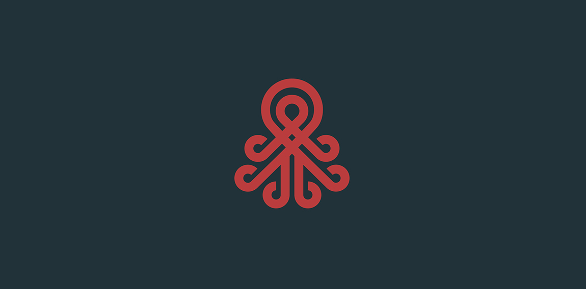
A geometric and minimalist logo design of an octopus.
Logo for construction company based on Brazil The mark is made of the combination of the letter M (company first letter) + a building that represent solidity, stability and trustworthy. The concept for their new identity aims at being fresh, modern and bold.
Textile Shop Logo
Library Logo
Gobro Con is a Toronto-based construction company.
Logo practice

Geometric logo
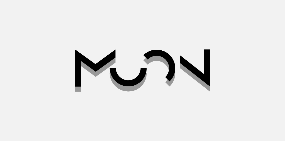
Logo for architectural/construction company. Strong, bold and custom-made wordmark. Minimalistic but elegant and unique. Symbolize construction and half circles resembles moon.

Contemporary design for online publication. With custom-made wordmark and clever use of negative space, this logo is unique and modern with touch of vintage art deco/art noveau look.
Vulpes AI provides artificial intelligence software and consulting services.

Imkerei Wojciechowski is an apiary from Austria. This contemporary geometric linear logo for an apiary reinterprets in a fresh way symbols common in the apiculture trade. The image of a bee emerges out of intersecting hexagons of a honeycomb. It creates a layout, whose aesthetic strength lies in the logic of construction. The logomark is complemented by the brand name written using an original angular typeface.

Nugno is a company that was formed when two compatible and creative individuals – Luca & El – came together. Grafting in collaboration, the pair multiply the excellence of their work, producing result- and experience-driven work. Their mission was to design an identity to define a distinct brand style that communicated the core values at the heart of the business – passion and creative brilliance. The final design combined a minimal typographic aesthetic and simple colour palette to create a distinctive visual identity communicating the purity of their style.