Fish logos (82)

An unused proposal for company selling fishing tools/accessories.


New York Fish logo, was designed for any company, dealing with fish selling, or any other kind of fish food. You can see the "crown" of statue of Liberty city in NY, and illustrated fish - New York Fish.

Designer: Denis Aristov Client: Karpof Cafe Industry: Cafe Keywords: carp, fish, food, cafe, restaurant, round
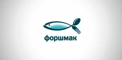
Designer: Denis Aristov Client: Ресторан "Форшмак" ("Forshmak" restaurant) Industry: Restaurant Keywords: restaurant, food, fish, herring, fork, spoon, forshmak, tasty, food, jewish cuisine

Social network
A sail boat on the top of a sea wave with a sky and fish that are shaking with it .

Logo for the design studio, which bears the name Cousteau )

Design made for a company based in a small village called Urk in the Netherlands. They Buy and Sell salmon.
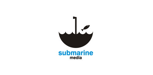
Logo for media company.

This logo is for a completely fictitious fish market.
The idea came to me when I discovered that it was possible to achieve a fish shape in the negative space within the bowl of the number 5. Dubbing my hypothetical company Pier 5 Fish Market, I created this very maximalist and illustrative mark in the hopes of really capturing the spirit of the nautical and maritime aesthetic. Type is custom for "Pier" and also the number 5, which is hand-rendered to look like it was painted on a wooden sign with a very wide, worn-out, thick-bristled brush. While it was important for the fish to show in negative space, it needed to look like a seemingly happenstance result of logical, real-world brush strokes. In the full lockup, the addition of the life preserver takes less emphasis off this gimmick, allowing one to slowly discover the fish.
Click here to see the case study for this logo, which chronicles its development, and includes full design rationale, sketches, electronic roughs, and alternate designs.

Furryfish Apps is a small independent iOS App shop, creating addictive Games and stunning Apps.

logo for fishing company

Logo for fishing industry

Logo for fish company