Family logos (12)
The Radford’s are the largest family in the UK and Hotfoot worked with them on their original website www.theradfordfamily.co.uk, as well as design and developing their brand new eCommerce website which was launched in 2015. The website was recently shown on the Channel 4 documentary 18 Kids and Counting. Charlie Haywood, Hotfoot Design’s Creative Director, said, “We were approached by Noel and the family to create an eCommerce site that would convey their commitment to good, wholesome food made from ingredients from local suppliers. As ordering a pie online is still quite novel, it was important that we designed a brilliant user experience that gave people the confidence their tasty pies would be delivered with extra care. After ordering one myself the other day, which arrived in a temperature controlled box, and which was, frankly, outrageously delicious, I am sure there will be many repeat customers!”


Locketdrive is an app and online service, where you can stash your family photos directly from your devices. The imagery I had in my mind is a woman who holds her photo in her locket drive necklace. Just like vintage locket drive necklaces.

Cattle farm in Tuscany (Italy).

Logo for a family-focused counselling / therapy organization.
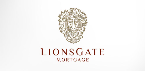
Antique, ornate, brass lion head door knocker logo for a growing and expanding mortgage company that wanted a new look, name, brand and image for their company. The brass knocker represents the entry way into the threshold of the home and the comfort a home signifies.

Saffron Hill - Residential Family Centre Mark Saffron Hill is a non-profit agency that provides assessment and support services to parents who have difficulty in caring for their child due to problems like violence, mental health condition, mild learning difficulty, drug problems... etc... Saffron is the most valuable spice in the world it and is worth more then gold in weight. The saffron flower has 6 blossoms and bears 3 stigmas from which the spice is produced. The family resembles the 3 valuable styles from the flower. SAFFRON HILL Typography is custom from scratch.
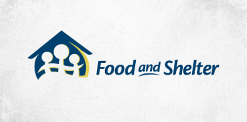
Logo for a non-profit company that helps families in need.

logo for a fruits production company