
Architects logos (3)
The identity of the builder JIMAV is based on the inspiration that we had with organic architecture. With curved forms we achieved a symbol with plenty life, which is balanced with a simple, legible and solid typography. The logo is a form developed with the approach of the letter “J” of Jiménez and the letter “A”of Avelar, which compound the name of the builder JIMAV. We developed a variety of the logo’s versions and compositions for the use in different applications and to make easier it’s reproduction.


Made this logo for health minded architects
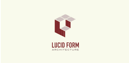
This logo is for a completely fictitious architecture studio called Lucid Form Architecture.
The icon is based on an optical illusion of a cube within a cube. Primarily, the form depicts a big cube, made of wood walls and metal-plated top surfaces, with a notch cut out of the center, resulting in a 3-D "L" shape. However, the longer one looks at this, perception begins to shift, resulting in a couple of different interpretations: 1) a small cube with a wooden wall and metal-plated bottom, in the corner of a room, hovering near the top of a tiled ceiling; 2) a room, tilted 90° clockwise, with hardwood floors, tiled walls, and a cube with a wood countertop and metal-plated side on the floor in the corner. This perception shift is important to the name, because it presents an ironic twist. To make "lucid" means to make clear, and while the icon seems to initially baffle and confuse, it ultimately encourages the viewer to challenge his or her preconceived notions of "perception." So too is the Lucid Form methodology for creating seeming impossible structures.