studionugno
I’m a designer living in Dublin, Ireland. It may be on the edge of Europe, but I collaborate with amazing people from all over the world.
I use design to allow people to connect, interact and be inspired by the most ambitious brands in the world.
I’ve been obsessed with designing and design since I was 12.
Maybe that explains why even though I’m Italian my cooking is horrible and I know nothing about football!
Edgy and out of the box. When it comes to design that’s me.
 Joined August 2016
 7 logos
 http://studionugno.com/

Sidd & Laine’s mission is to help the world shine a little brighter with jewellery and accessories that look great and make people feel fantastic. The collection consists of jewellery that is lovingly hand-made by artisans in northern India. Designed using natural, semi-precious stones, the range compliments styles as varied as boho-chic, the oh-so glam socialite or even the jeans and T-shirt kind of gal. We were thrilled when we were commissioned to design Sidd & Laine’s brand identity. Aiming to attract a fashionable female audience, the new logo incorporates a geometric shape based on authentic Indian patterns. Serif typography, a vibrant colour palette and luxurious print finishing, like gold foil, were used to combine an elegant and exclusive personality.


Nugno is a company that was formed when two compatible and creative individuals – Luca & El – came together. Grafting in collaboration, the pair multiply the excellence of their work, producing result- and experience-driven work. Their mission was to design an identity to define a distinct brand style that communicated the core values at the heart of the business – passion and creative brilliance. The final design combined a minimal typographic aesthetic and simple colour palette to create a distinctive visual identity communicating the purity of their style.


Based in Denver, Colorado, Tenacious Landscaping is involved in projects ranging from town to country gardens, and uses both traditional and contemporary styles. Our design work for the Tenacious Landscaping brand coincided with a revised content and monetisation strategy. So we chose the wild beauty of the bighorn sheep, the State animal of Colorado for this vibrant company’s brand identity. Boasting horns that can weigh up to 14kg and an intrinsic part of Native American mythology, this animal captures the spirit of Colorado wildlife and reflects Tenacious Landscaping’s brand values of power and elegance.

Montereale is a horse riding school located in Maniago, a little city in the North east border of Italy. The school represents a relaxing and friendly but modern and elegant as it is located in one of the most important regions Friuli Venezia Giulia’s river. Our job as brand developers was to create a personality where we could glorify traditional meeting between horse and nature. The work is rooted in an engineering and modern approach to our assigned tasks. We are interested in getting involved in a project from the beginning to the end; from the preliminary idea to its realisation. While working closely with the client towards a common purpose, we stay focused on the detail which makes the quality of our work.
Studio Copper is an american company that handcrafts genuine copper mugs that was born in 2015.
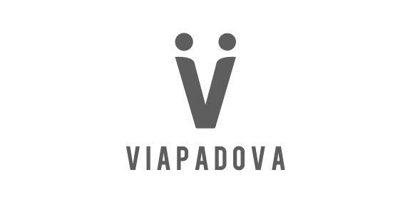
Once upon a time, the area known as Via Padova in Milan, Italy, had a less than salubrious reputation. Our project was to help change that image by creating a new identity for the area that would bring the various groups of people – or local tribes as we called them – together. We needed to represent Via Padova as a space that welcomed every one of its citizens – a challenging proposition. The city needed a visual system, a graphic identity that could organise and simplify communication with the people. We used the letter V to symbolise a handshake – and hence the union and coming together – of two people, symbolising a community coming together.
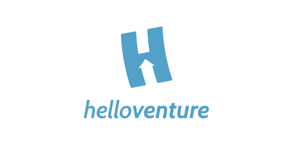
Hello Venture is an organisation that brings start-up communities together and creates spaces for entrepreneurs to learn and work. In this case, the brand identity that we created focuses on the letter H with an arrow inside to symbolise the progressive growing of the new enterprises. The H is flying up. The logotype is set in lowercase letters to emphasise the company’s humble and friendly approach. The colour scheme represents security and confidence. The result is a minimalist identity with customised typeface and flexible print material.