LogoMoose
  • Logo
    Galleries
    • Featured logos
    • Most rated logos
    • Most viewed logos
  • Identity
    Galleries
    • Featured identities
  • Packaging
    Galleries
    • Featured Packaging
  • Designers
  • Competition
  • Upload
  • Become Member
  • Login

The Fleet Street Press

  The Fleet Street Press  
The Fleet Street Press
Facebook
fb-share-icon
Pinterest
Reddit
  • The Client needed to give his venue a modern and more recognizable visual identity. Fleet Street has been associated to publishing ever since the year 1500 circa and is home to press and publishing related businesses. 
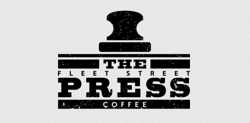
The logo represents a coffee tamp above the name of the venue, but can also be seen as a vintage type character.The Fleet Street Press Designer: Paolo Ertreo
  • Submitted: 12/27/2013
  • Stats: This logo design has 2572 views and is 0 times added to someone's favorites. It has 1 votes with an average of 3.00 out of 5.
  • logo
  • london
  • Paolo Ertreo
  • press
  Designer  

Paolo Ertreo

View portfolio

  More logo design  
6oczek

Logo for company which sells board games. "6 oczek" - means 6 pips on a dice (in Polish). Also word "pip" means "eye" in Polish so it's a little wordplay :)

rozminComments0Dec-21-13
Lobo Contex

Brand design for accounting advice. 2017, Três Lagoas, Brazil Brand concept: The challenge was to work the figure of Lobo, which is the name of the company; In a more minimalistic way and with surrounded forms; The construction of the brand was done through circular grids to make the project more harmonized.

brunohenrisComments0Aug-04-17
Higher Grounds

'Higher Grounds' is coffee shop in Cloudcroft (New Mexico) situated 9000ft above the sea level with cool hills.. It's a kinda tourist spot.. So that's where this logo came from.. My idea is to show the place (Cloudcroft) with mountains and to take it over the coffee in a single line drawing.. And few colors added to make it more scenic by having the business on the core of the logo.. so it's kinda 50% for the business and 50% for the place..

shihabComments3Jun-15-11
Canada Paint

Unused proposal for Canadian Paint company, name changed. Logo shows an abstract maple leaf in the negative space.

square69Comments0Sep-09-13

  About  

LogoMoose is an inspiration and design community that was launched in 2008. It showcases logos, identities and packaging submitted by professional designers, design studios or agencies. We showcase the best work from the best designers from around the globe. Become a member now and create your own portfolio!

Get your daily dose of inspiration to work on your own design projects and get your business moving. Be amazed by our logos, identities and packaging on this worldwide platform. We‘re here to inspire you and help you impress your clients and fellow designers. Get an overview of global trends in logos, identities and packaging. Browse our galleries and discover all the latest design trends.
We know you love your work!

© 2008 - 2025 LogoMoose.com - All logos are property of their respective owners.
FAQ - Privacy Policy - Imprint