Javista

- Javista is a beloved coffee shop at the heart of Hollywood. With more than a decade of experience, the owners decided to transform their humble shop into a larger, more professional brand with two new locations and a whole new vision. Javista’s existing design language were lacking some important aspects. They had multiple attempts toward better branding but there were problems in execution. As none of the designs completely reflected the brand personality, they kept using some of the old materials which created an inconsistent brand look and confusion in customers’ minds. The sign showed one logo, while the cup displayed a different one and the website included both in different ways. Multiple fonts were used with inconsistent sizes and spacings, and colors differed throughout all mediums. Our goal was to come up with a fresh and modern yet timeless identity, that elevates the Javista brand, and prepares it for the new business plans and the future. While doing that, we would also pay homage to a couple of its earlier visual elements, which were the big ‘J’ and the crown as a mark of their promise on quality excellence. After a meticulous exploration which ended up as a 185-page design presentation loaded with creative ideas and mock-ups, the final identity was shaped and approved by the team.
- Submitted: 08/19/2024
- Stats: This logo design has 1262 views and is 0 times added to someone's favorites. It has 2 votes with an average of 2.50 out of 5.
ozankarakoc
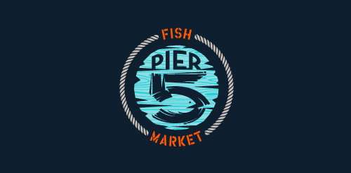
This logo is for a completely fictitious fish market.
The idea came to me when I discovered that it was possible to achieve a fish shape in the negative space within the bowl of the number 5. Dubbing my hypothetical company Pier 5 Fish Market, I created this illustrative mark in the hopes of really capturing the spirit of the nautical and maritime aesthetic. Type is custom for "Pier" and also the number 5, which is hand-rendered to look like it was painted on a wooden sign with a very wide, worn-out, thick-bristled brush. While it was important for the fish to show in negative space, it needed to look like a seemingly happenstance result of logical, real-world brush strokes. This is the minimal, alternate version of this logo.
Click here to see the case study for this logo, which chronicles its development, and includes full design rationale, sketches, electronic roughs, and alternate designs.


