


Deer and Bird Logo
This simple and elegant logo features a deer and a bird standing next to each other in a circle. The deer is looking down at the bird, and the bird is looking up at the deer. The logo is a symbol of unity, connection, and cooperation. It also evokes feelings of peace, harmony, and nature.
This logo is available for sale.
Contact us for detailed information.
Looking for a custom logo design?
I’d love to help! Contact me at hello@logofarmers.com
Giraffe Logo
ou can buy this design by contacting me. You’ll own the copyright and the customization if required.
Also if you’re interested in working together, get in touch.
Contact me: hello@logofarmers.com
Logo Design: Letter H + Arrow
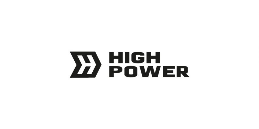
This bold and modern logo combines the letter “H” with an integrated arrow design, symbolizing progress, direction, and forward-thinking. The clean geometric structure makes it versatile and suitable for industries like logistics, technology, or consulting. Its minimalist black-and-white design ensures adaptability across various branding mediums.
Availability: This logo is available for purchase with an exclusive license, ensuring it is unique to your brand and will not be resold.
Contact: For inquiries or customization, reach out to hello@logofarmers.com.
G for Ghost Logo
This logo takes a delightful twist on the letter “G” by cleverly using a friendly ghost! The ghost itself forms the negative space for the letter, making it a unique and memorable design.
Concept: A playful logo where a friendly ghost creates the letter “G” through negative space.
Character: With big, round eyes and a warm smile, the ghost brings a charming and approachable feel to the design.
Applications: Perfect for businesses or products wanting a fun and whimsical vibe. Ideal for gaming companies, children’s entertainment, educational apps, or even personal brands.
Looking for a custom logo design?
I’d love to help! Contact me at hello@logofarmers.com
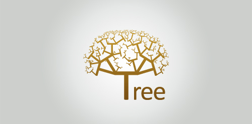
All Saints

This logo was designed for a church in New Zealand, All Saints in Nelson. While they had an existing logo, it was felt by the leadership and the wider congregation that it was in need of a much-needed refresh. They were hopeful that they could retain the tree as a main device but they weren’t sure if that could be done. They also wanted a logo that would also serve to symbolise they had solid foundations as a church, along with a strong fellowship that welcomed everyone, while celebrating the cultural heritage and diversity of New Zealand. They were convinced they were asking for too much.
A L P

The logo incorporates the first name initial of the three family members of the founder. A, L, P configured into the two Austrian alpine mountain peaks nearest the founder’s home (symbolising the founder “A” and his wife “L”), and the rising sun (which represents his daughter “P”) which symbolises the promise of the future and the need for and focus on, sustainability. The company was established in Hong Kong to promote the generation of electricity using innovative technology with environmentally sustainable resources.


