Most viewed logos – Page 539


The icon is a combination of a butler and an apartment building. Similar work can be seen at www.designsourced.com. Thanks for looking! -Brian

Amblar Abogados

Logo designed for Tec Traders
diana band

A new logo and identity designed for a publisher in St Petersburg, FL. Client wanted "Florida" colors they chose and mixed throughout the logo.
The logo incorporated multi colored "pages" opening at the top to illustrate the diversity in their product offerings. The swoosh incorporated a wave of water tying the logo into it's SeaSide name.

The Scout is a TV reality Show being developed in Toronto, Canada to choose the best soccer player for a chance to play in the Toronto FC team.

A logo design for a motorcycle shop

Logo for Littlehampton Waterfront festival 2012
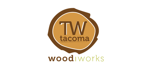
This logo was part of a re-branding project. Tacoma is an organization that works with its clients to create custom designs for Kitchen and Bathroom.

SumoMania logo for Sumo Suit hiring company in Adelaide, South Australia by DivParty
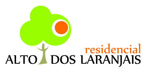
Its a Residential in Brazil, and in english it means something like "The Place of Oranges".
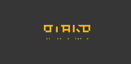
just for fun "o tak o"

takethephotographer
The logo resembles a Nevada license plate which is easily recognizable by the customer’s prospects.

Selling baseboards


Logo design for a clinic in Portugal

Our services are in the registration of the trademarks around the world