Most viewed logos – Page 538
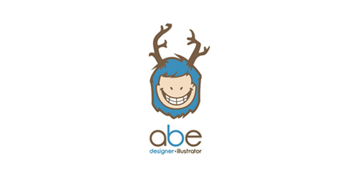
Personal Project - 2011
My very own logotype =)
The symbol is my take on a "Wendigo" an ancient, cannibalistic demon-spirit of the northern reaches (mainly the Inuit and Eskimo cultures of northern Canada and Alaska) said to posses someone with an insatiable hunger for their fellow man.
As far as to why I chose this for my logo... well, err... I guess I just like it, lame justification for a logo, believe me, I know, but oh well, I'm happy with it.
Leave a rate to show some love!


mr adventures
Signtipcko

Inspiration came from the owner. The 2 ss at the end stands for the luxury of the buisiness. Our big concerne is that people are interpretating it wrong; and think about the evil germany of the late 40-50's. However, we don't see it like that. You can also imagine the contoure of a lady. Therefore, please every opinion is helpfull to decide if we continue with this logo. Thanks

Logo for a travel agency . Can be modified as per name

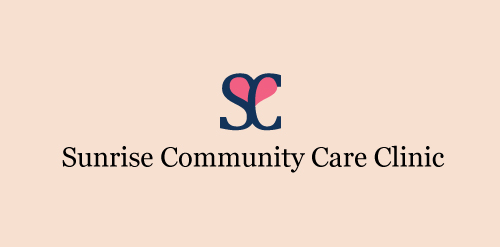
This is an unused proposal for a health care clinic, I made a heart within the 'S' and 'C' to represent care and health.

Vos Photos En Peinture

Logo for a company that prints and publishes children's books.

Logo for new watch brand. Dangeruss is a play on the owners name - Russ.

The icon is a combination of a butler and an apartment building. Similar work can be seen at www.designsourced.com. Thanks for looking! -Brian

Policlínica Veterinaria Castellón
diana band
Black cat is small design outsource company Providing Services related to design media where we achieved our goal as designers with lots of various designs and our core value to provide high quality design as per client satisfaction. Here my web: www.blackcatvn.com


Amblar Abogados
